Realtors
Needs listing photos and visuals that make buyers stop scrolling, book more showings, and help homes sell faster. Visuals that stop buyers scrolling and sell homes faster.
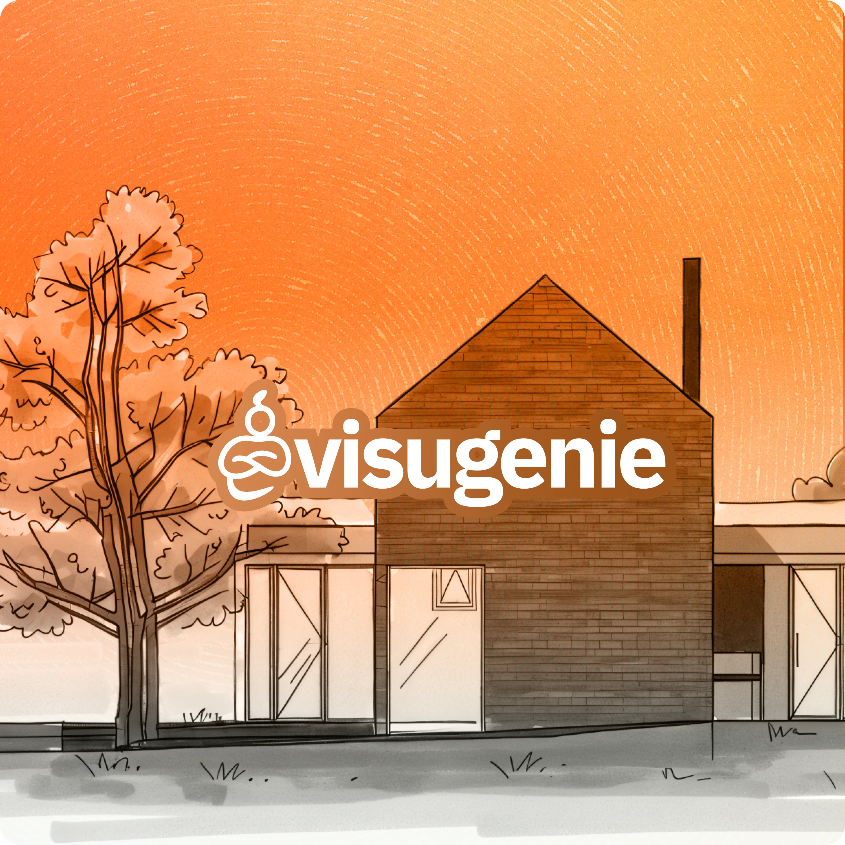
Visugenie is an AI-powered real estate visualization tool.
The product was already live with over 20+ users and 1000+ generated images when I found the founders online and reached out cold to help.
This was my first real frontend project and it was a rush job.
Before public launch, one week, start to finish.


Before our first meeting, I conducted user research by interviewing an active Visugenie user and over 5+ realtors within my network to better understand their needs, workflows, and pain points.
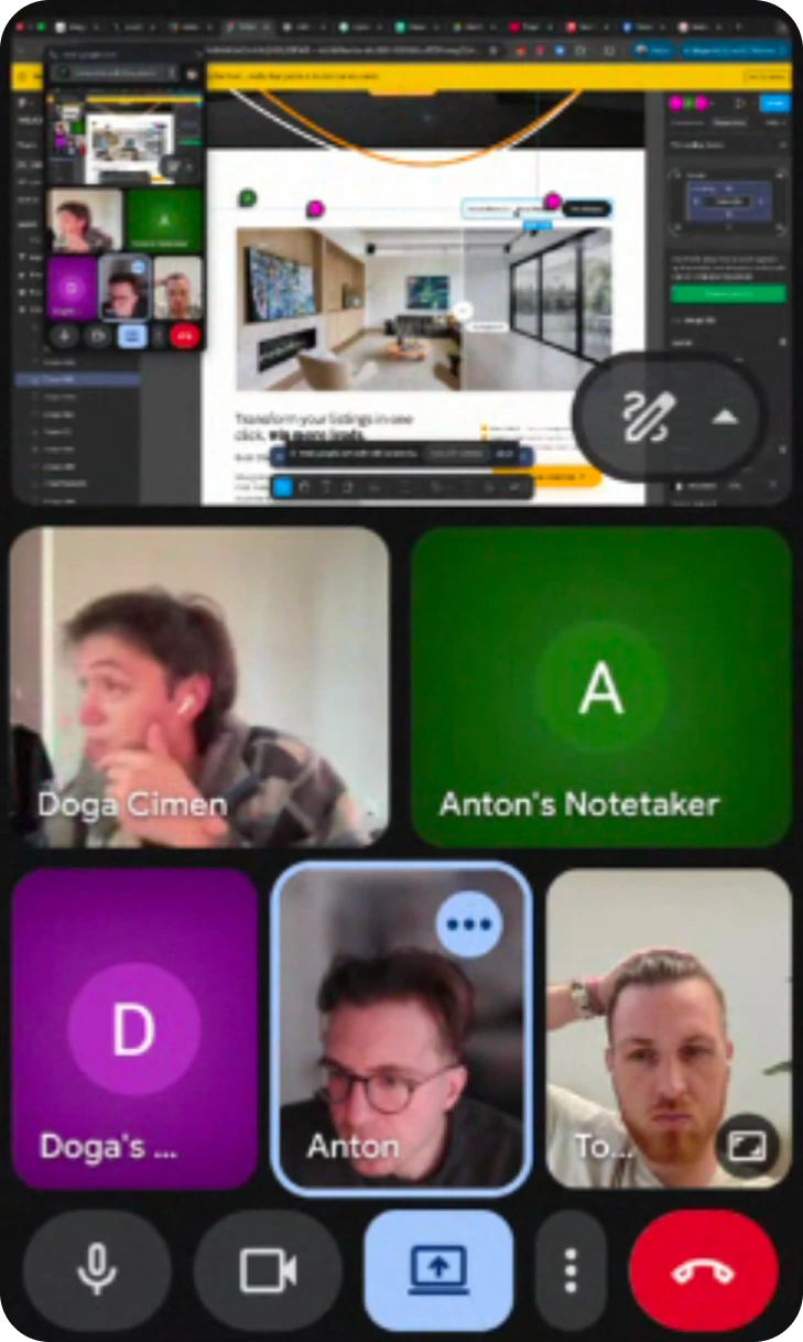
The first meeting was the design session. I came in with directions, we went back and forth, getting to the final design took entire day of pitching directions, collecting feedback, and iterating.
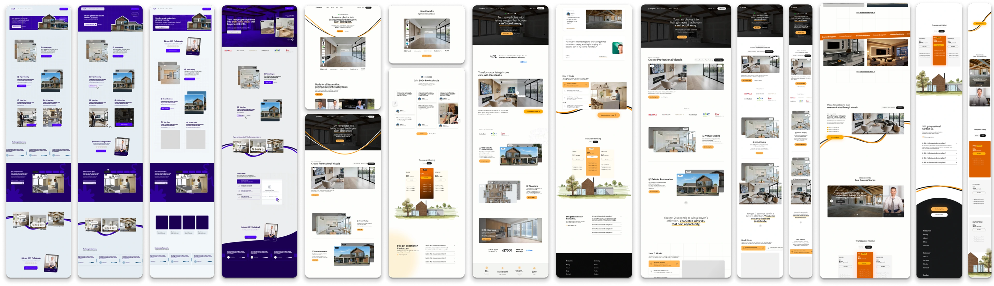
Through active collaboration, I re-built (hero, features, pricing, and how-to-use) landing page while some sections (like the navbar, faq and footer) were implemented by the developer. The final build reflected their implementation decisions, giving me a clearer understanding of constraints when working in a shared codebase under tight deadlines.
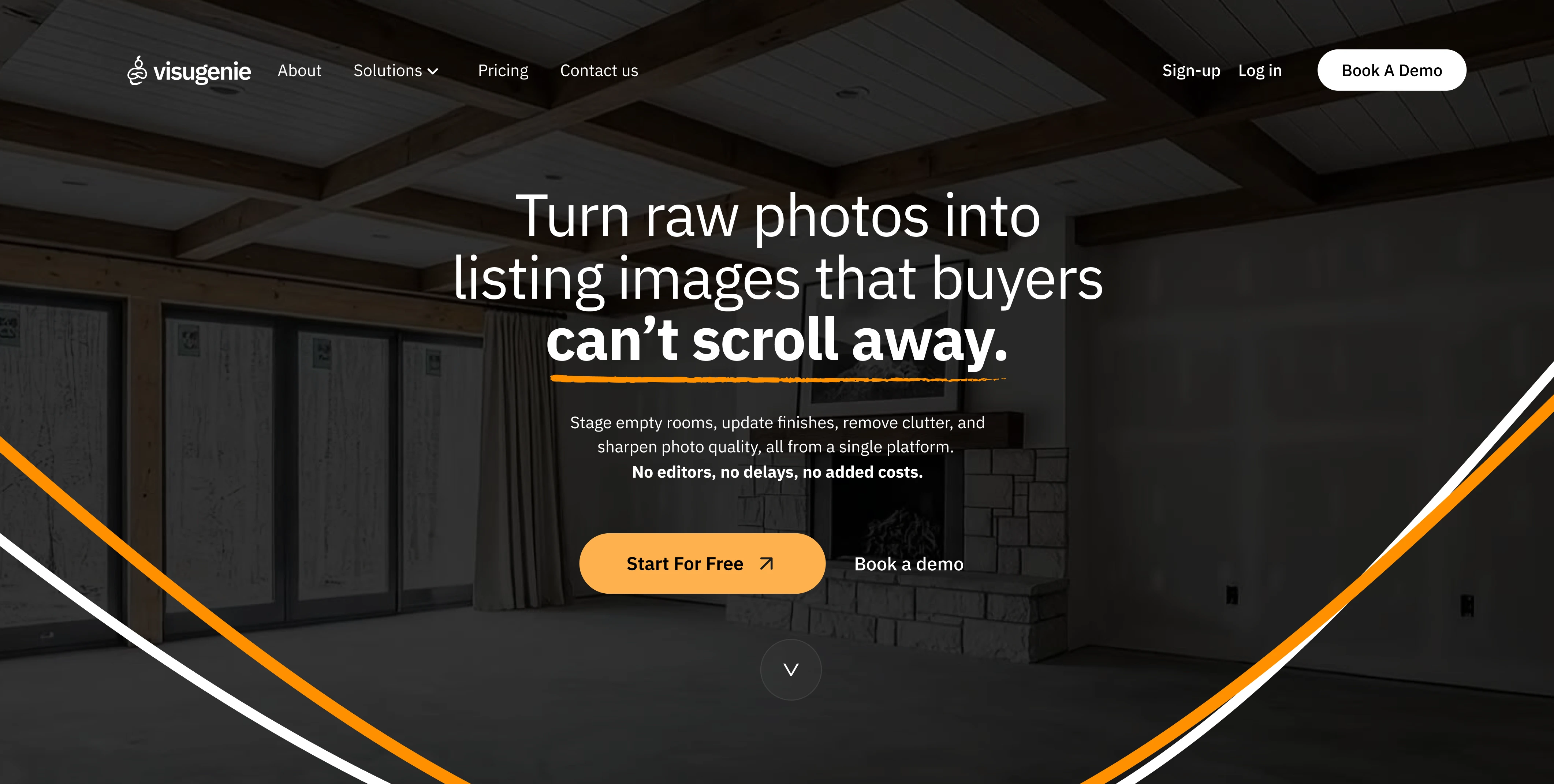
New website
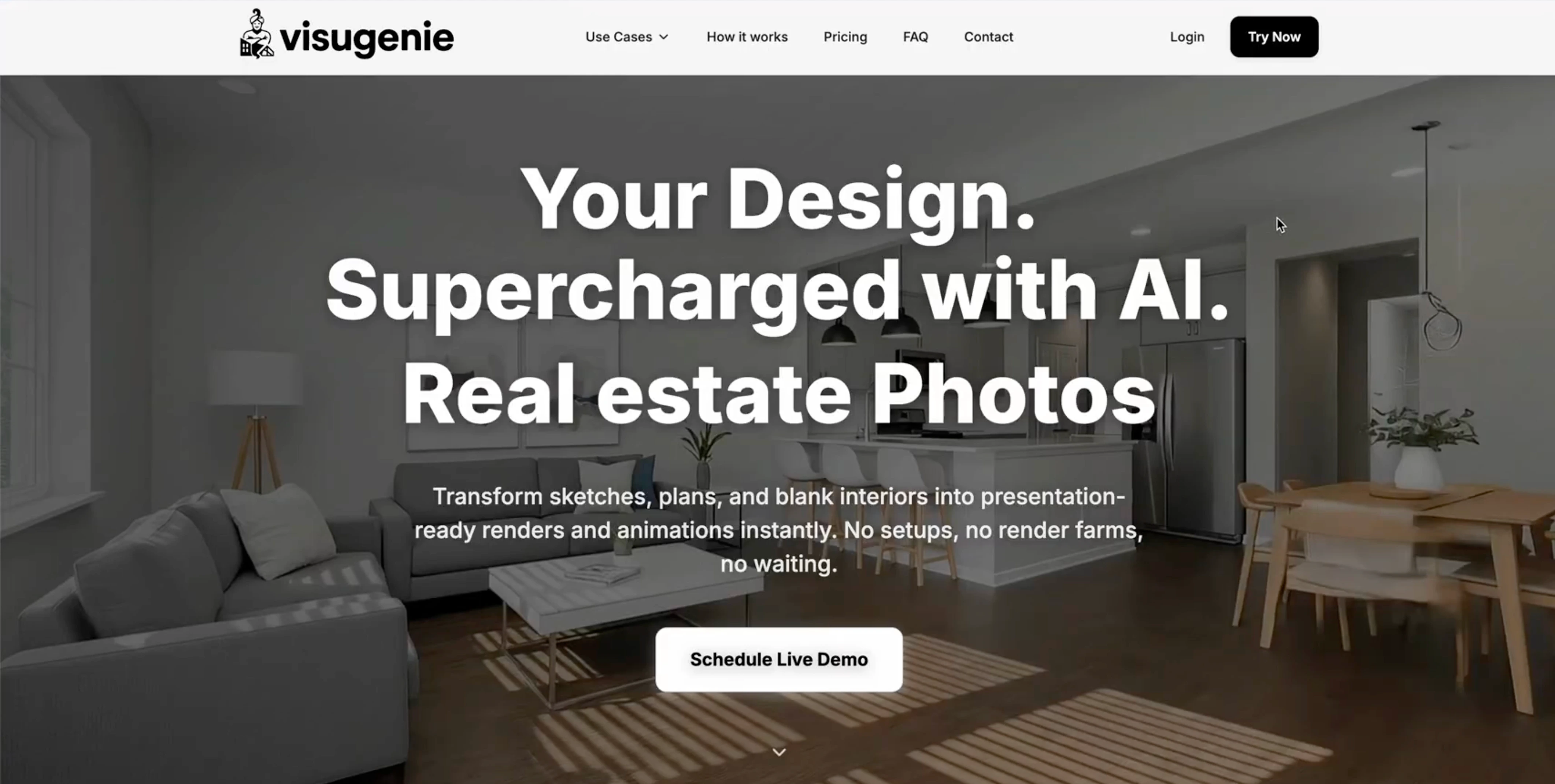
Old website
User research and competitive analysis revealed three distinct user types.
Each entering Visugenie with a different mental model and goal.
Needs listing photos and visuals that make buyers stop scrolling, book more showings, and help homes sell faster. Visuals that stop buyers scrolling and sell homes faster.
Needs clients to clearly see the finished result so they can make decisions with confidence before construction even starts. Clear visuals so clients approve before construction.
Needs realistic visuals that help clients instantly understand the design and say yes to the concept. Realistic visuals that win client approval.
All three of our user types were landing on the same generic interface with all kinds of features after signup, which was a critical friction-point and triggered massive-churn in the product.
The solution was not separation, it was intent-first orchestration.
So I designed the onboarding to assign each user one of three values:
$ primary_intent = { real_estate | architecture | interior_design }
# This was the simplest, framework-agnostic approach.
# Implementable across most modern frontend stacks (e.g. React/Next.js, Vue).
Let us tailor the Visugenie experience for you.
How will you use Visugenie? Select one
Before (asset-download flow)
At the end of the user's journey, users had to tap download multiple times to get their assets,
get held hostage inside a wait-modal, and re-initiate an action
they thought they had already taken.
1. Click image
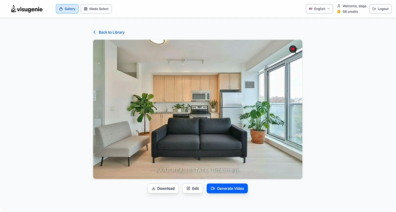
2. Click download
3. Select upscale
4. Click download again & wait for download
5. Land on confirmation page & click download once again
High Cognitive Friction
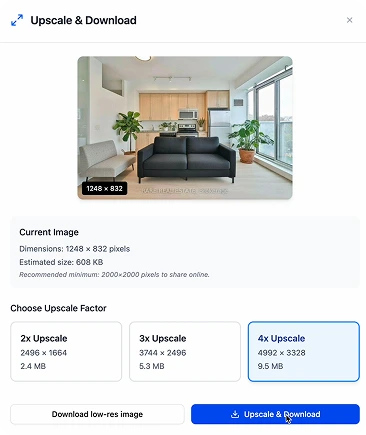
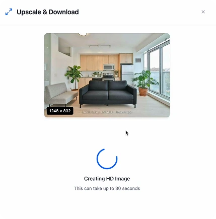
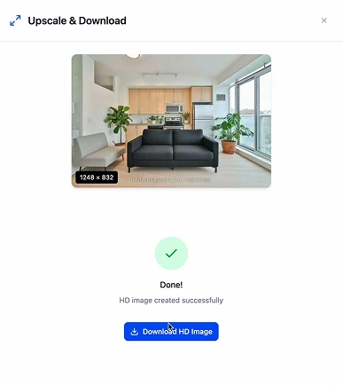
After (redesigned flow)
The redesigned flow has three steps. Select the image, choose
upscale options or download, download starts automatically
when ready. No intermediate page. No second download button. No
uncertainty.
/new-download-1.webp)
1. Click download icon on image
/new-download-2.webp)
2. Select upscale (download starts on select).
/new-download-3.webp)
3. No need to wait, as download already started.
5 3
steps to complete task
~8s ~3s
significantly improved product speed.
~60%
faster user-facing flow
I'd build in a checkpoint with engineering before the week was over. The product was still moving while I was designing, and one rush pass left little room to reconcile drift — a mid-week alignment would have caught mismatches earlier.
Designing for a product still being built also means some decisions will get implemented differently than you designed them, or not at all. The onboarding system and the download flow were handed off as Figma files. The job is to make the reasoning clear enough that the right decision is easy to make.