Redesigning Shared Expenses
for the People, Not the Math.

The Problem
Splitting money with friends shouldn't feel like a transaction. But every app built for it treats the problem like accounting, not like a relationship.
#1 biggest competitor biggest competitor biggest competitor biggest competitor
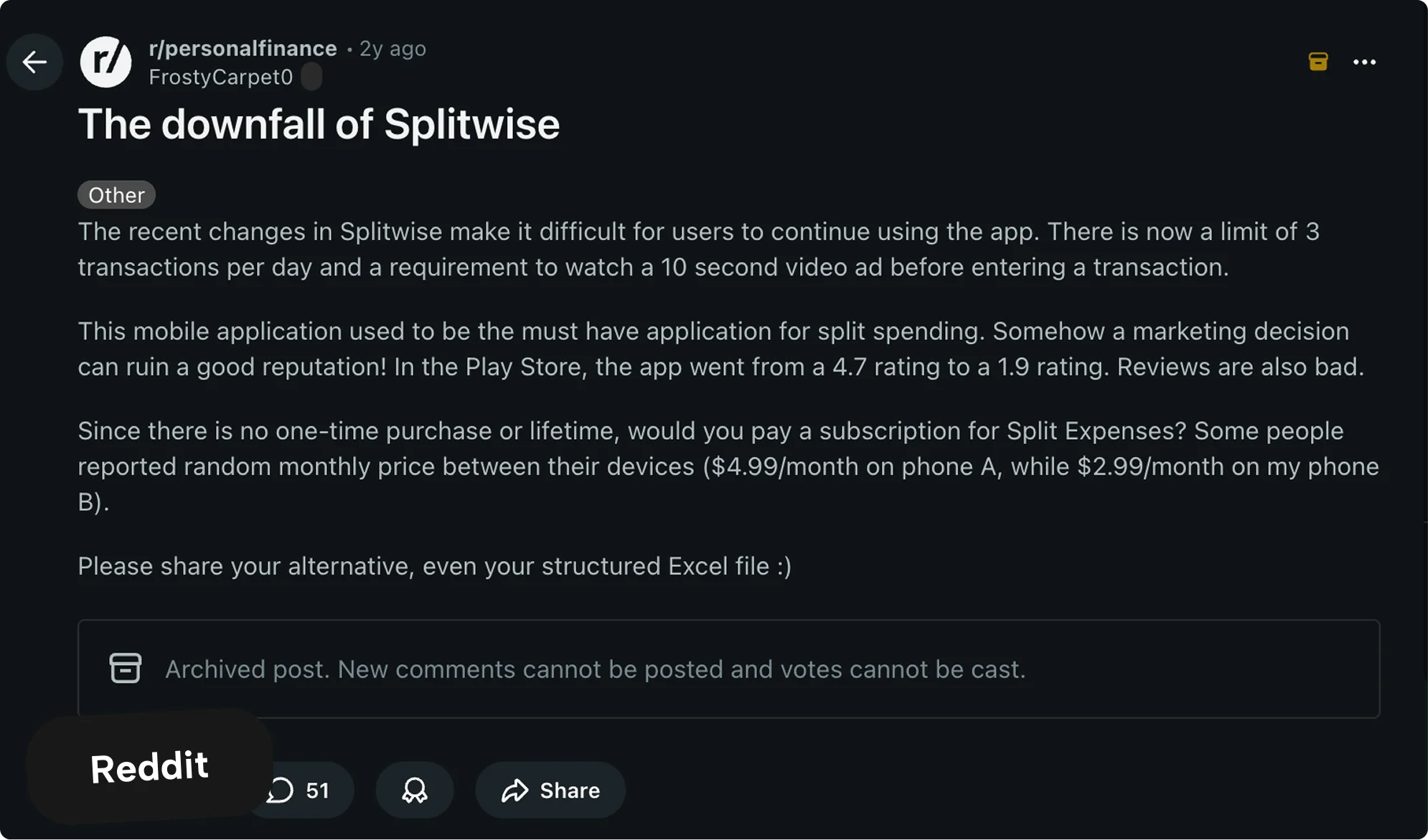
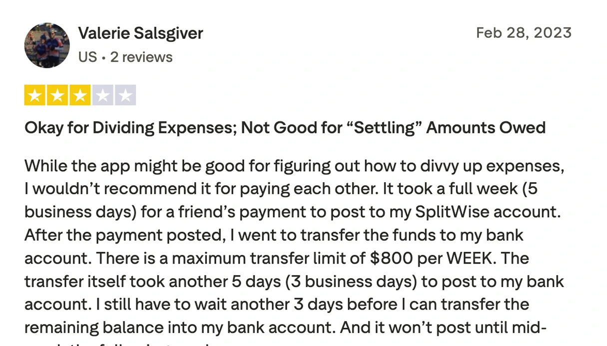
Splitwise has 10 million users and hasn't touched the emotional side of the problem in 8 years.
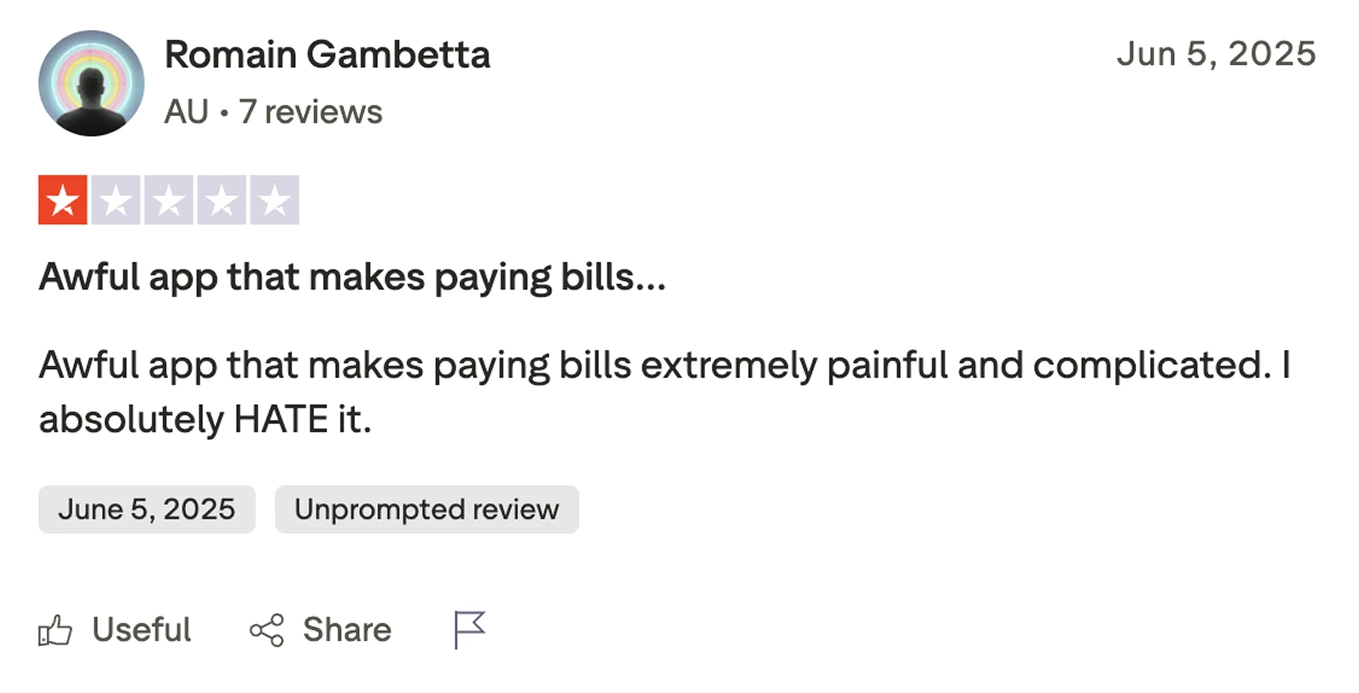
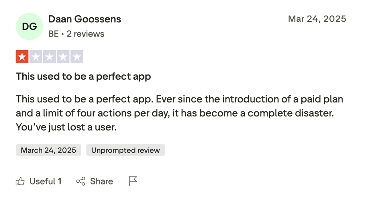
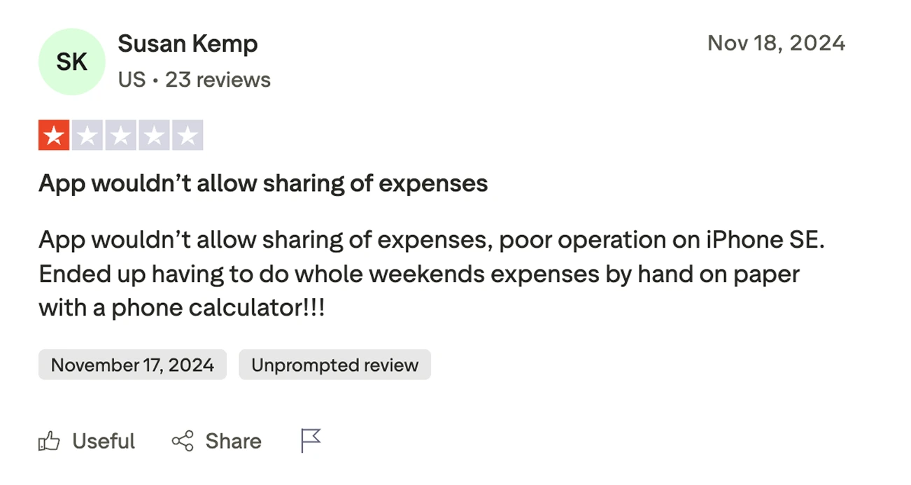
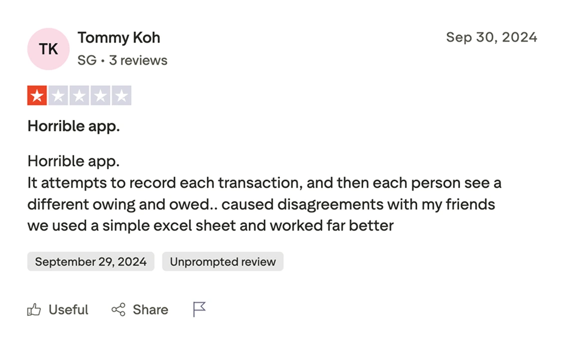
I went through 200+ App Store and Reddit reviews. The same words kept showing up: nagging, petty, transactional, awkward. More than 20% of people complained about too many notifications. Nearly 40% felt like the app was making them cheap by being so precise about every cent. The app is good at math. It's not good at friendships.
The Research
It started as a personal frustration. Then I wanted to see if other people felt the same way. I looked at Splitwise, Tricount, and Venmo. I read through App Store reviews, Google Play, Reddit. Over 200 data points later, the pattern was clear.
The emotional gap
People don't want a debt collector in their pocket. Every existing app confuses being fair with being good. People want good. Close enough on the math is fine.
The real job
The job isn't "split this bill." It's "don't let money make things weird between us."
The Solution
What if splitting money actually felt like it was about the people and not the numbers?
A cost feed that looks like a timeline of things you did together, not a spreadsheet. Every entry is a memory that happens to have a number on it.
Debt simplification that figures out the fewest possible payments to settle everything up. No unnecessary back and forth.
Gentle nudges instead of reminders. A quiet note inside the app if something has been sitting too long or is a small amount. No push notifications, ever.
Reflection
The biggest product decisions on Bountt weren't about what to build. They were about what to leave out. Every "no" in this project, no reminders, no red colour, no debt language, was harder to stand by than any "yes." The constraint is the product.
What I'd change
Signup is the biggest point of friction in Bountt right now. I know it. It's the first thing I want to fix, removing the gate entirely while keeping the app secure underneath.
What I learned
Using AI to build faster doesn't replace thinking clearly. Every part I hadn't thought through properly became a problem. Every decision I hadn't explained clearly enough drifted in the wrong direction. The tools are good, but the thinking still has to come from you.