One platform for a community
running on
Excel sheets and good intentions.
Gracelle
Our team lead and industry mentor, providing guidance throughout the project.

Ji Woo
Owned the art direction across the app. Collaborated on the UI decisions.

Doğa That's me!
Led UX research, UI design, Testing and built the HTML prototype.
Caitlin
Led branding, illustration, hand-drawn iconography, and copywriting.
The Problem
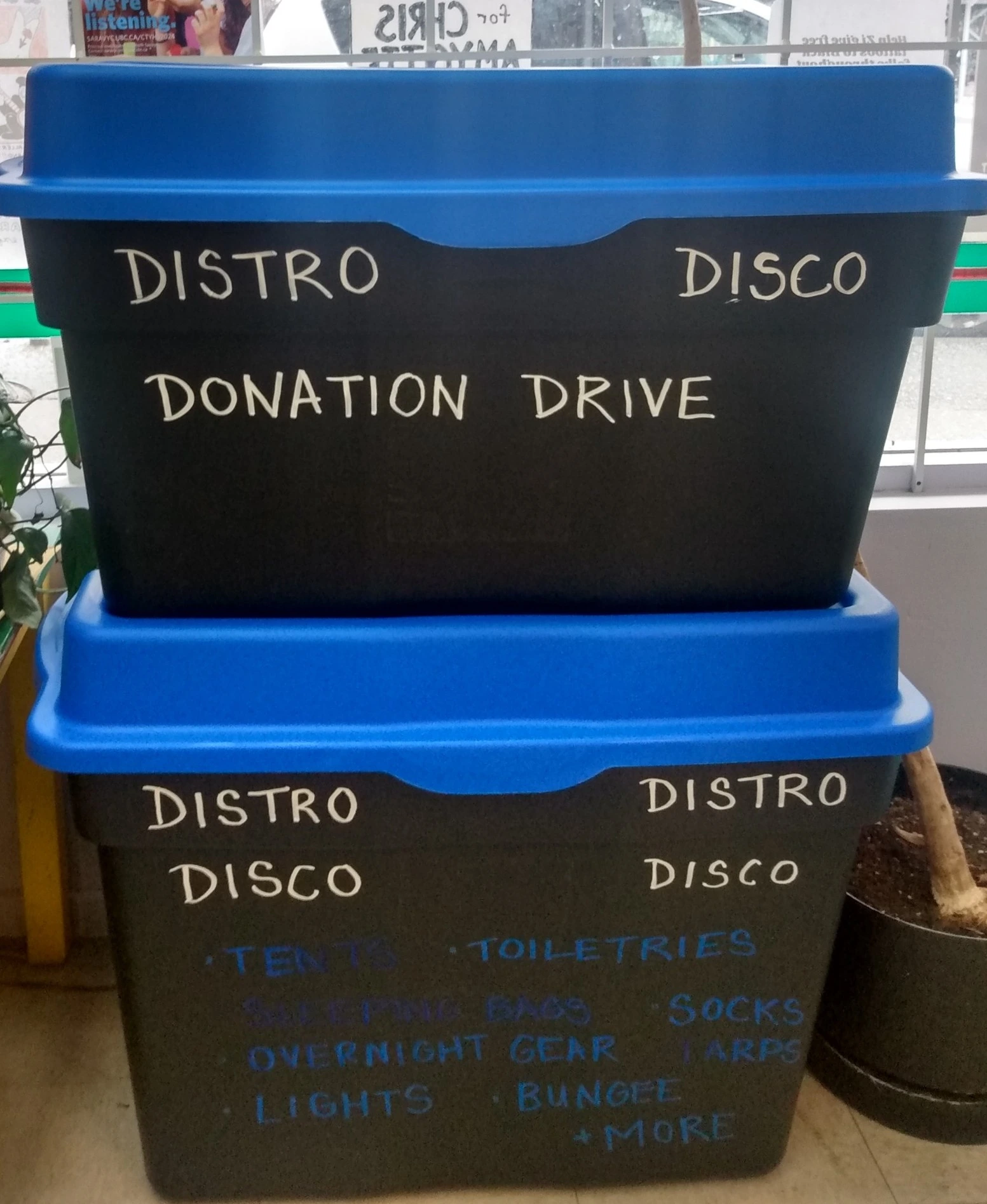
Distro Disco runs a mobile free store out of a converted bus, distributing essentials to unhoused neighbours across Vancouver every week. Volunteer-run, community-funded, and explicitly anti-capitalist. The work is real. The logistics, before this project, were not built for scale.
The Research
Before opening Figma I spoke with Ren, an active volunteer and organizer at Distro Disco. We talked about what the organization actually is, what it wants to become, and how it runs.
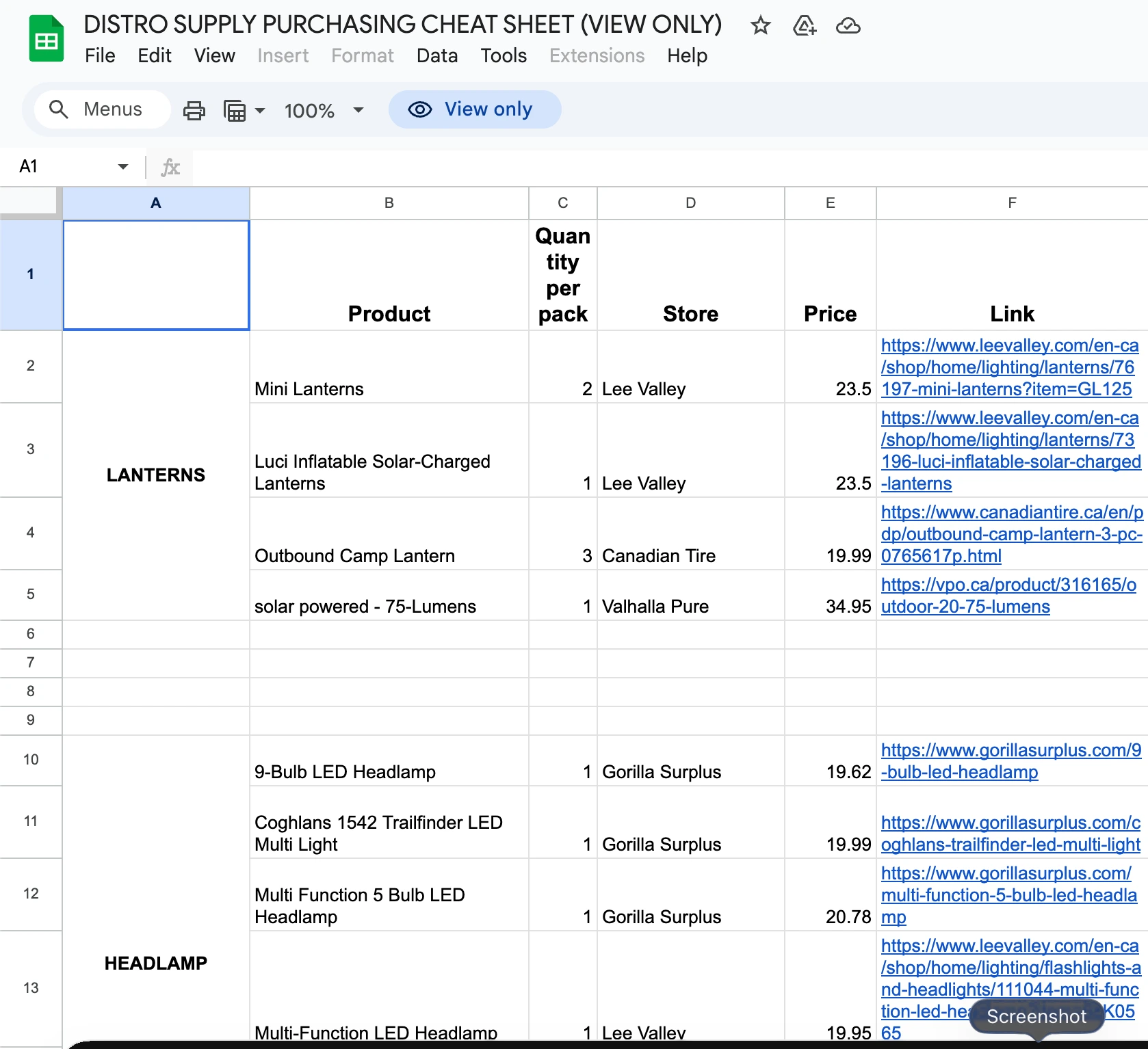
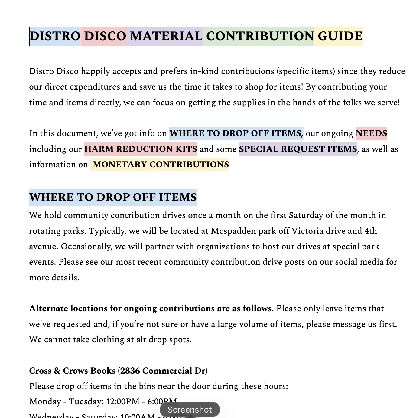
Everything ran across WhatsApp threads, Discord servers, Google Sheets, and Instagram posts.
The organization ran on goodwill and group chats. We wanted to see what it could look like with a proper digital home. We just thought they deserved something better.
Through the RGD Project-Based Mentorship Program, our team built a brand system and an interactive prototype to consolidate all of that into one place.
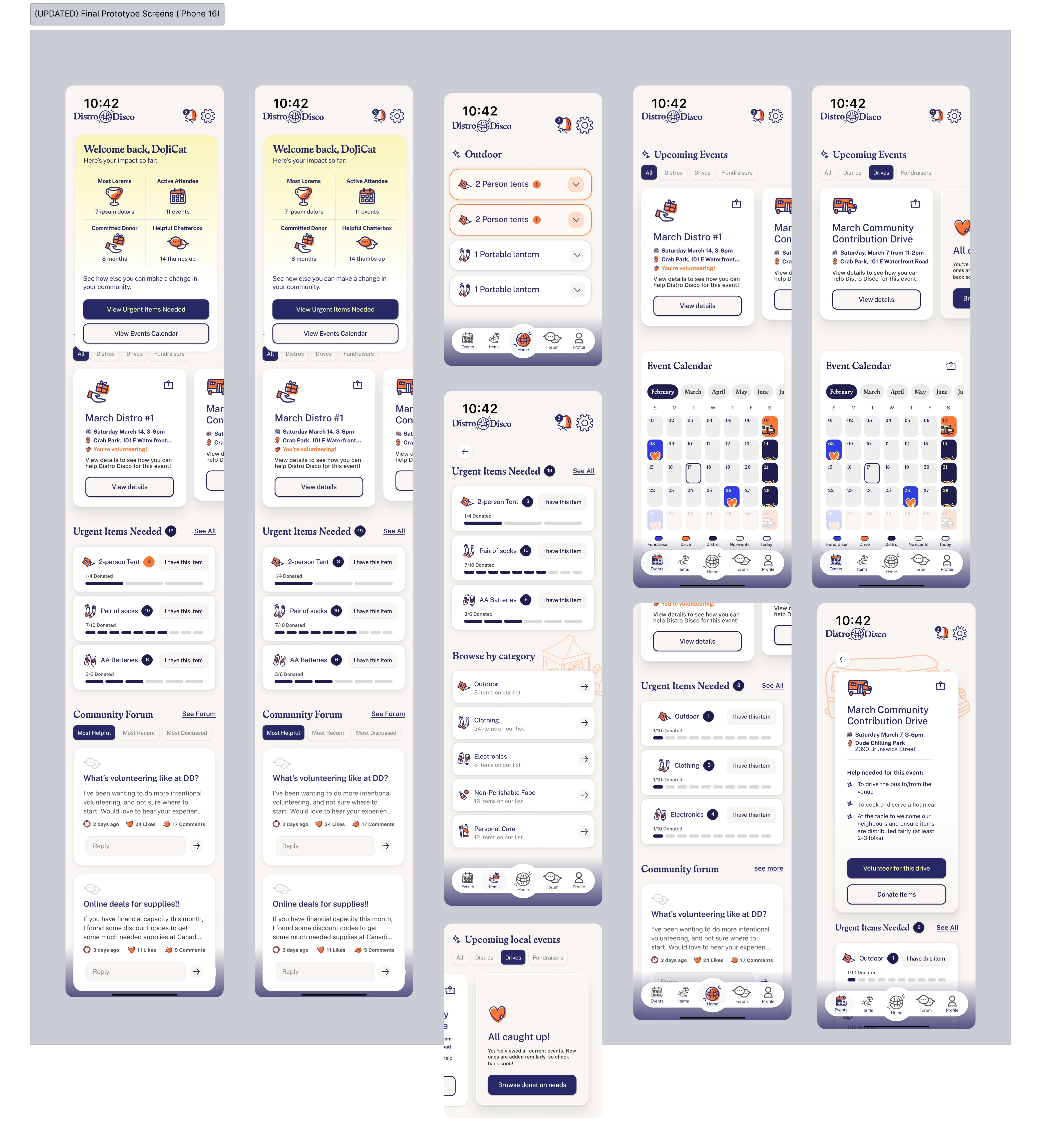
The Solution
Early explorations leaned into a clean, premium aesthetic. It looked good. It did not look like Distro Disco. The team landed on modern DIY craft — warmer materials, more human layouts, and hand-drawn iconography — still trustworthy and usable, but with the texture of an organization that makes things by hand and means it.
Warm and Human
Clean and Modern
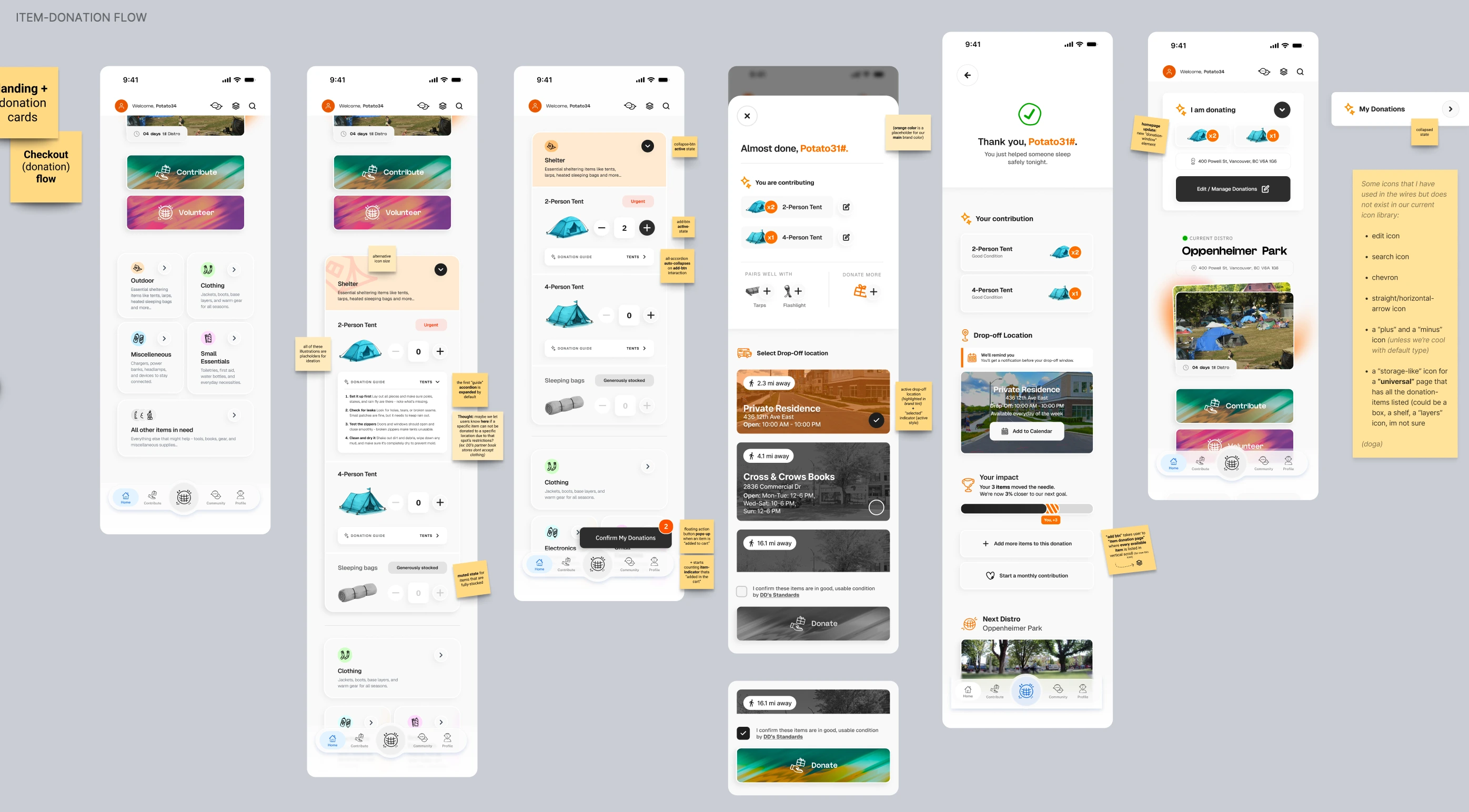
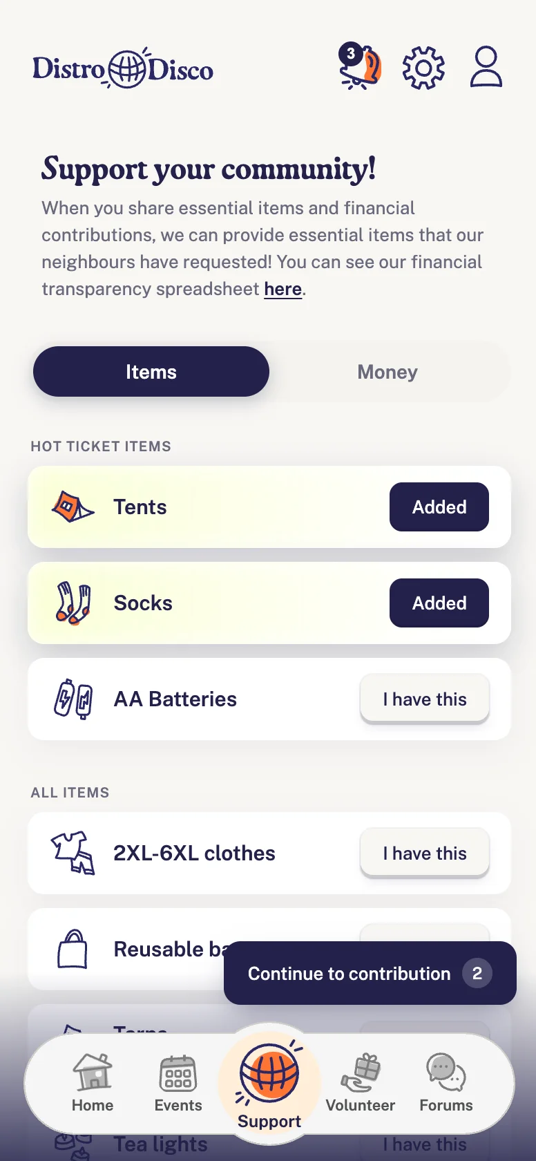
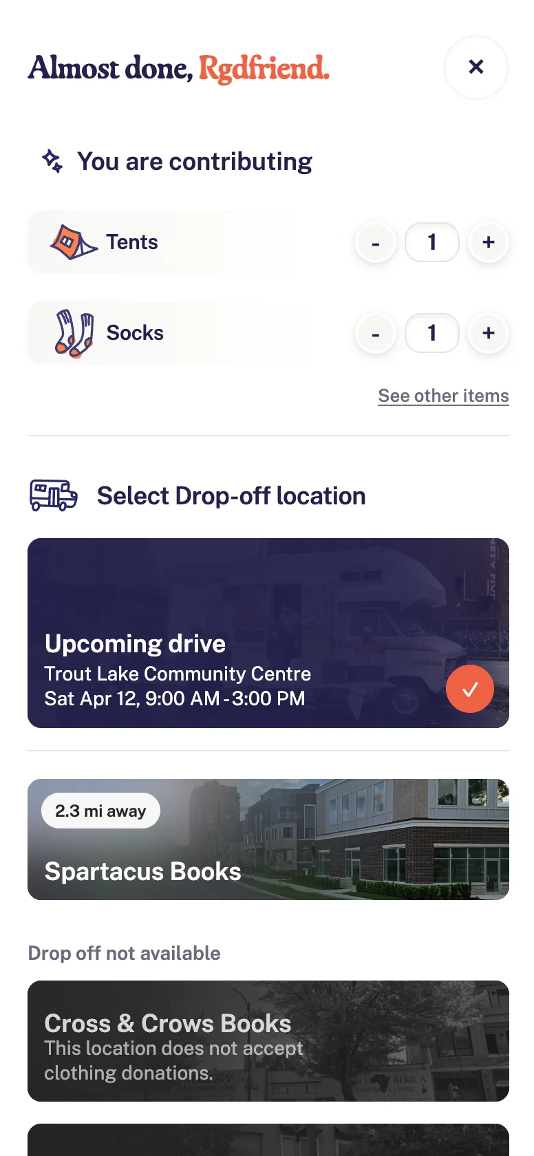
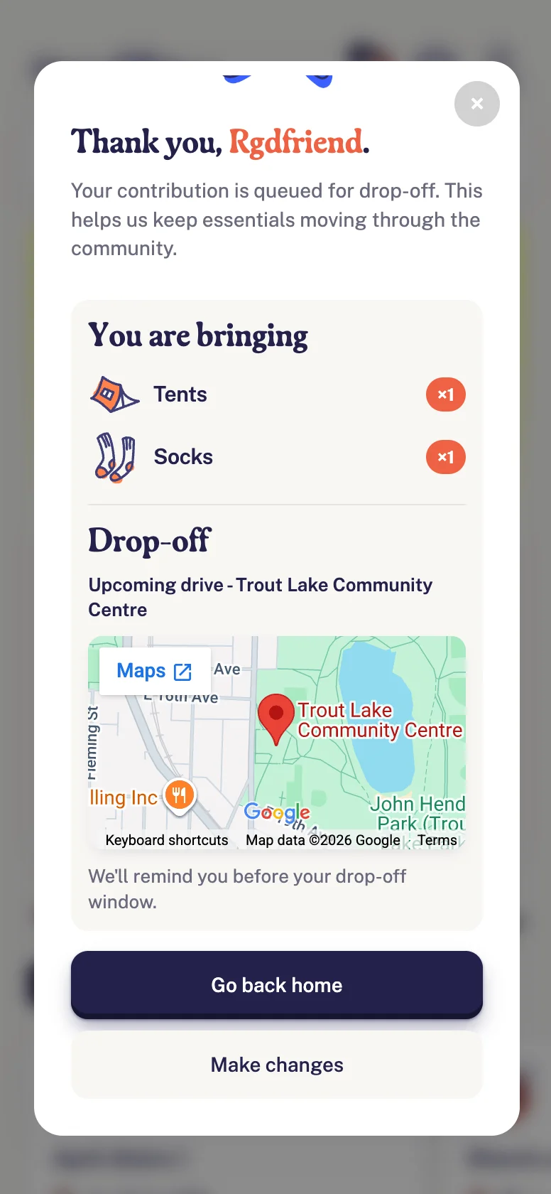
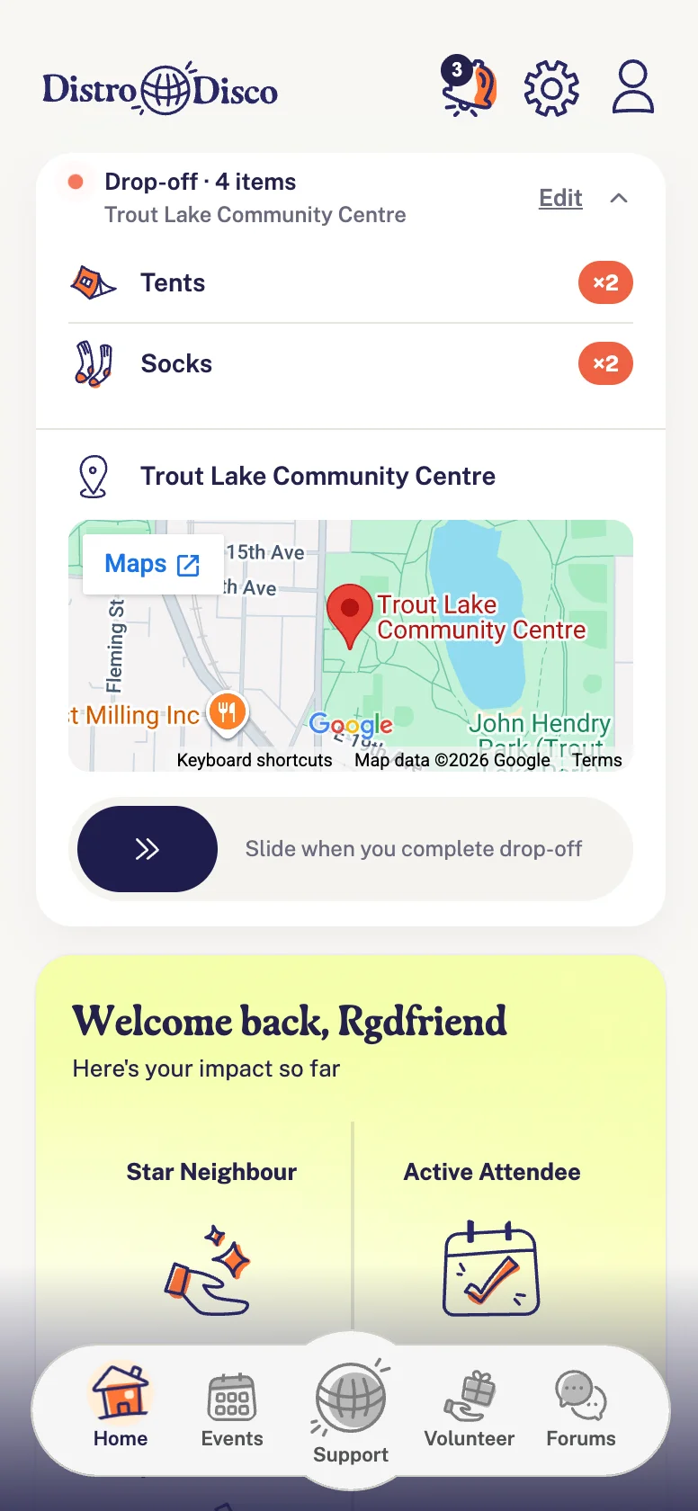
Our main goal was to get people to donate more.
So, the centerpiece became the item donation flow.
The Interaction System
Every interactive element across the app uses one spring system — one stiffness value, one damping constant, one timing token. Buttons, cards, nav items, and role cards all compress slightly on tap and spring back with a small overshoot before settling.
Slide-to-confirm, then a button
The prototype originally used slide-to-confirm. Testing showed the gesture added friction without adding meaning. We replaced it with a button. Knowing when to remove something you built is a skill.
Spring-bounce interaction system
A product that feels physically real is one people trust to do real things.
On tap, every interactive element across the app—buttons, cards, nav items, role
cards—compresses to 0.93 scale and springs back past resting with a
slight overshoot before settling.
Shared motion language
Nav icons each have their own spring animation on activation — home bounces, forum bubbles expand with staggered dots, volunteer bags toss and settle — all on one shared timing system.
The Result
The final prototype was presented to RGD stakeholders in a formal team pitch. We walked through the problem, the reasoning behind the solution, and ran a live interactive demo.
The prototype made the difference — stakeholders could feel how a donor would move through the app.
The project was published in the RGD's May 2026 mentorship article alongside ten other teams from the Fall 2025 cohort.
Reflection
What I'd change
I would spend more time in research before moving into design. We started discovering things about how Distro Disco actually operates well into the project and had to go back and rethink decisions we thought were settled. Understanding the organization deeply before the first wireframe would have saved weeks.
What I learned
We had one hour a week together and relied heavily on async communication in between. It worked, up to a point. Partway through we realized what we needed was not more messages but more time in the same room thinking together. A team that communicates well does not just share updates. It thinks out loud together.