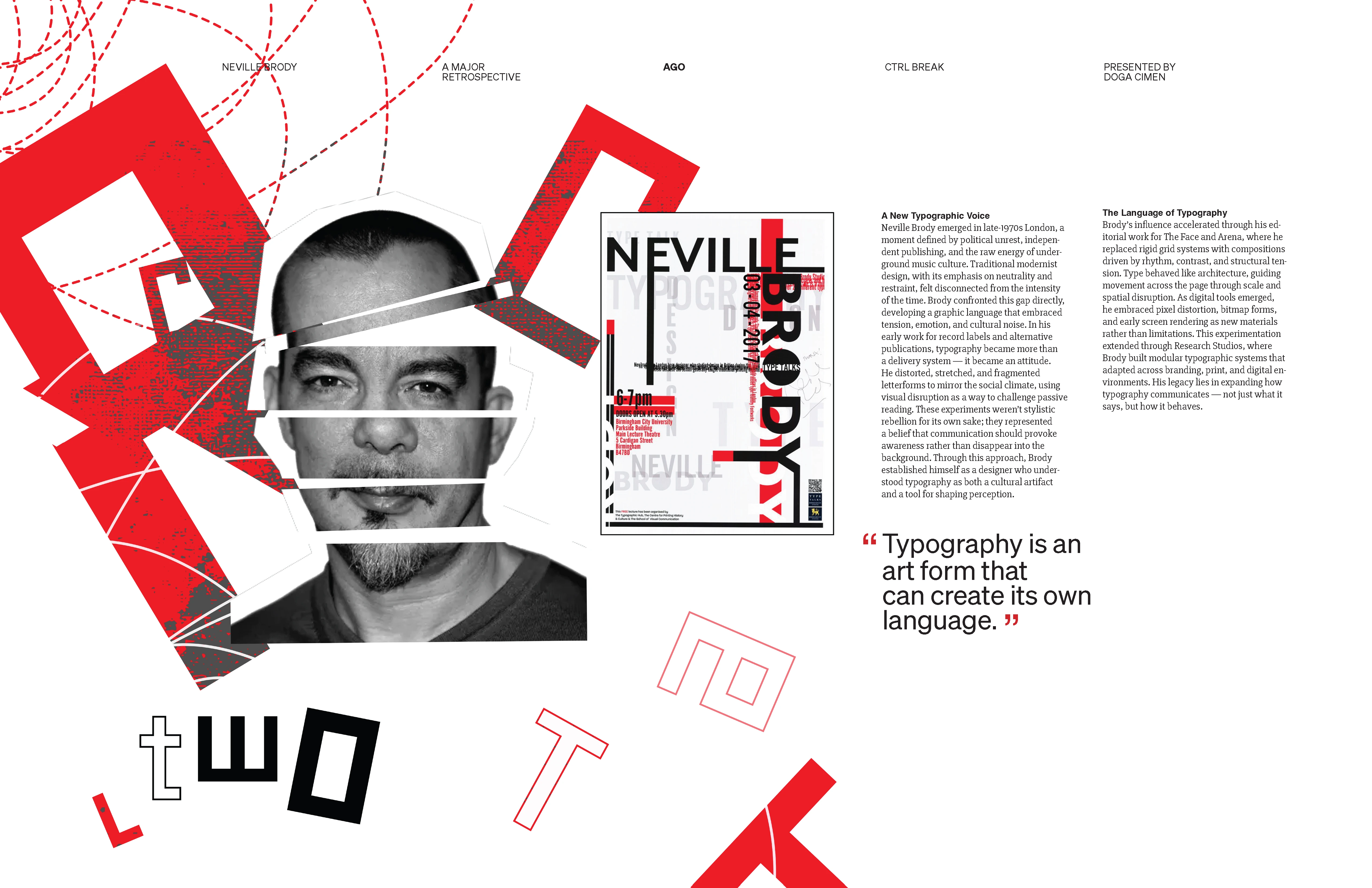
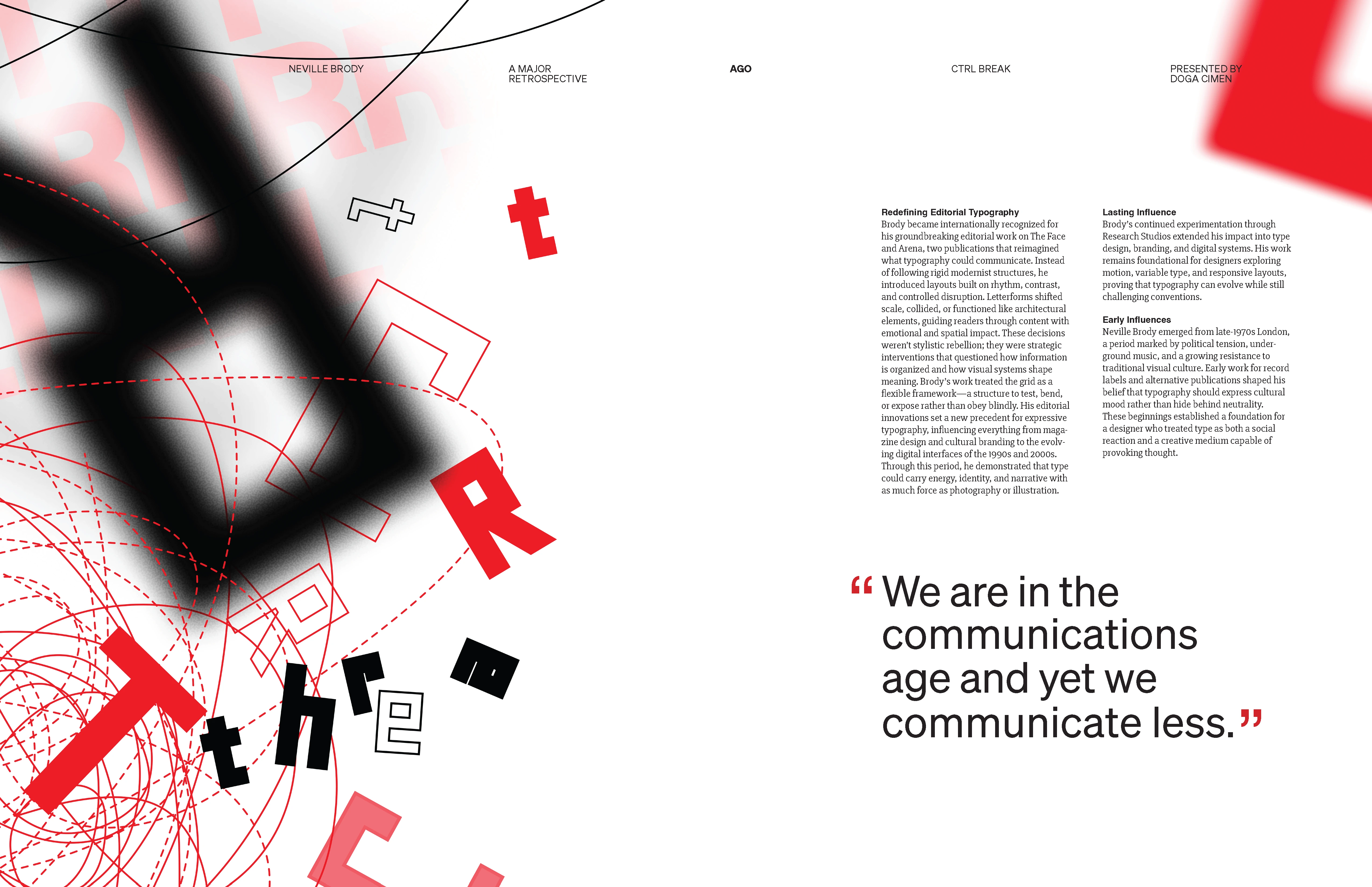
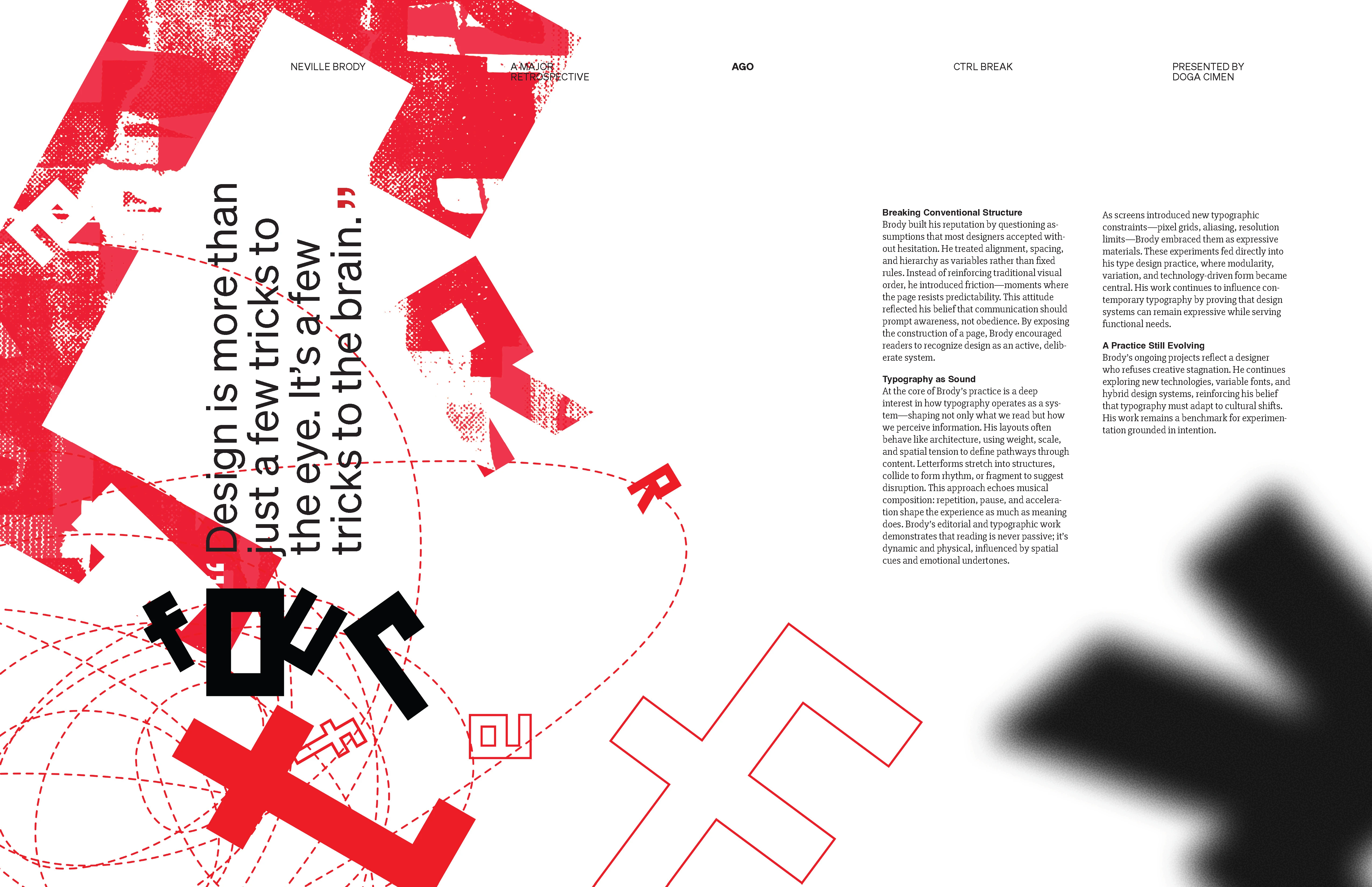
Built an exhibition identity for a Neville Brody retrospective around controlled visual interruption.
Overview
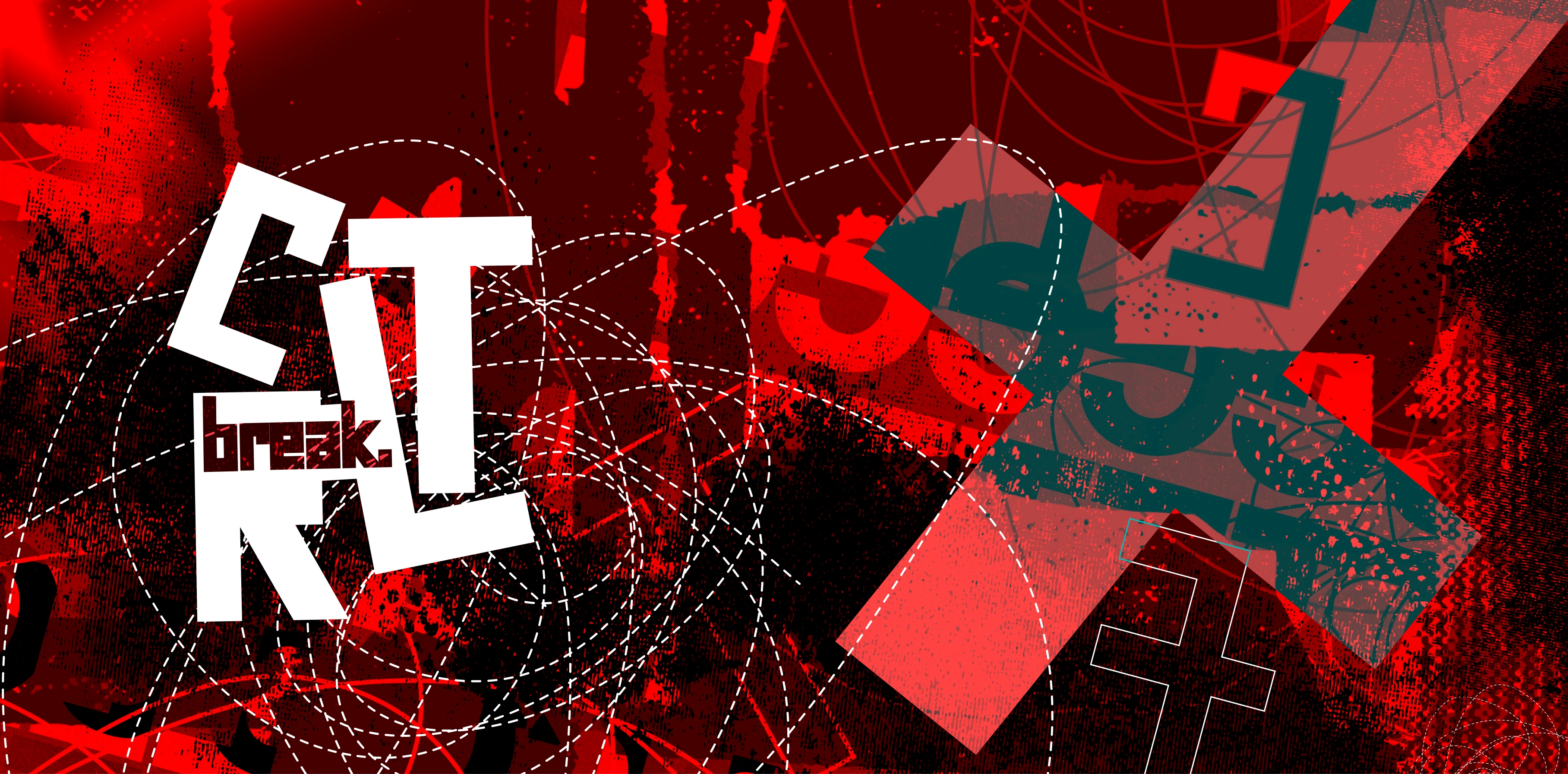
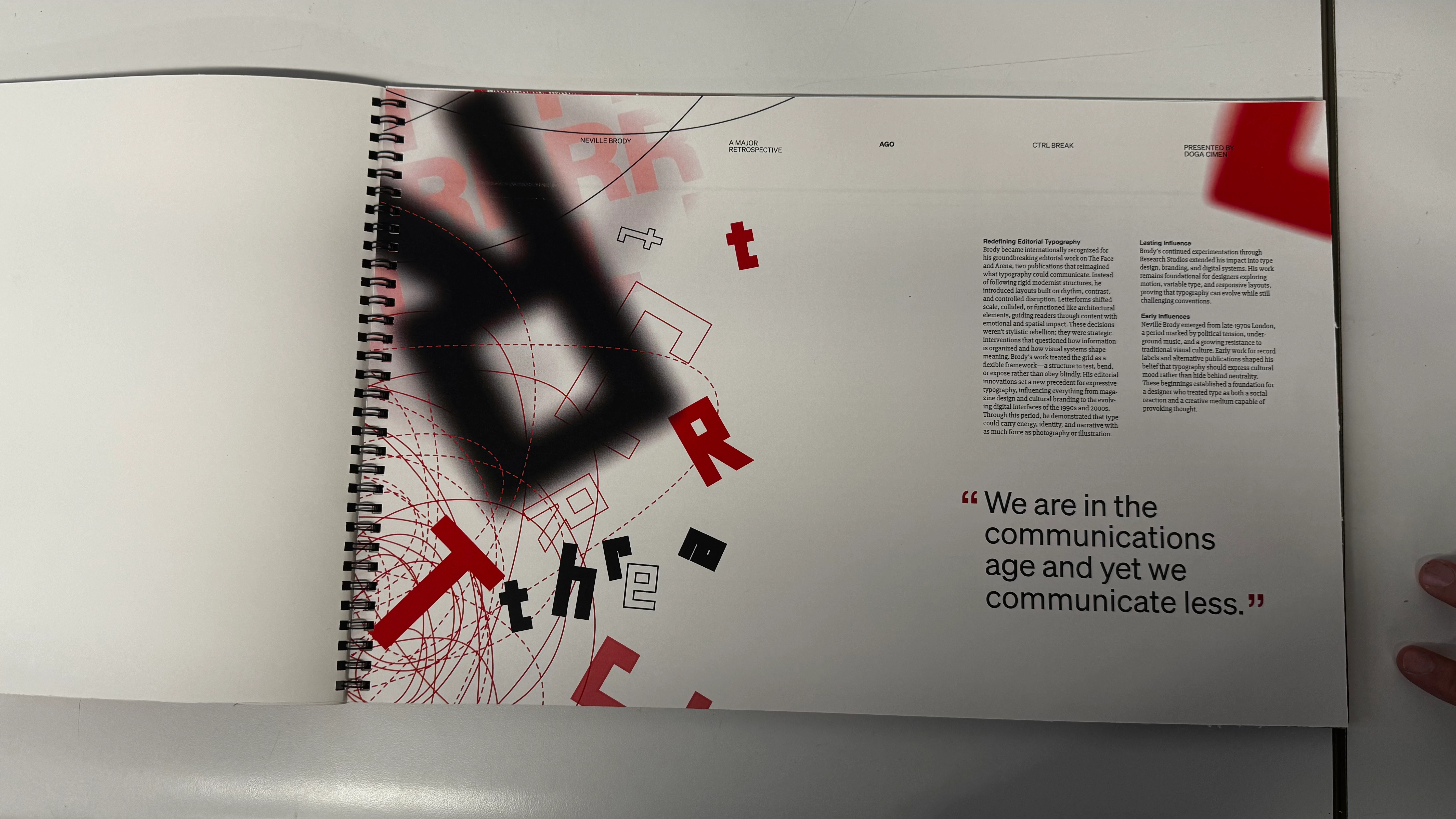
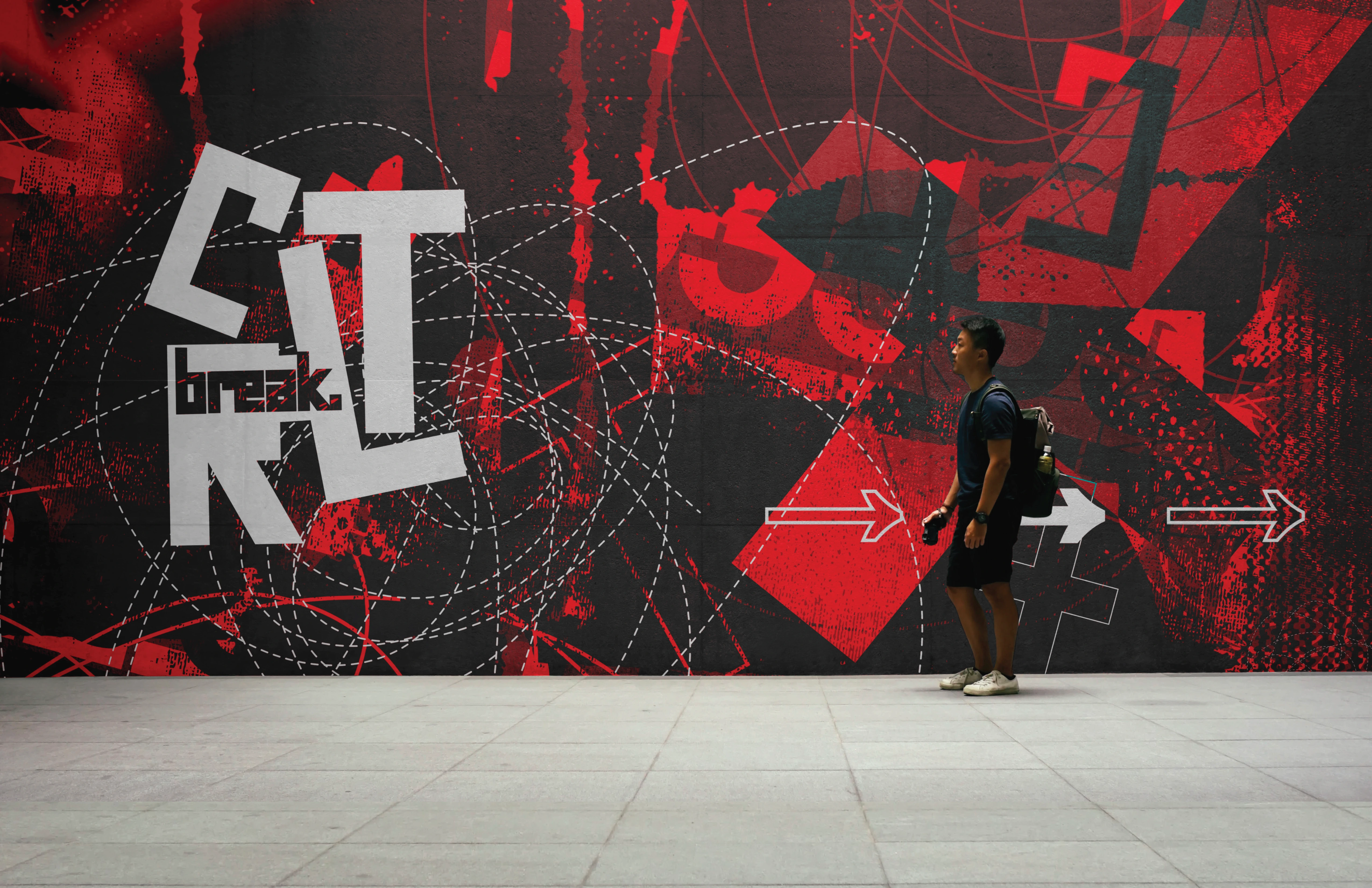
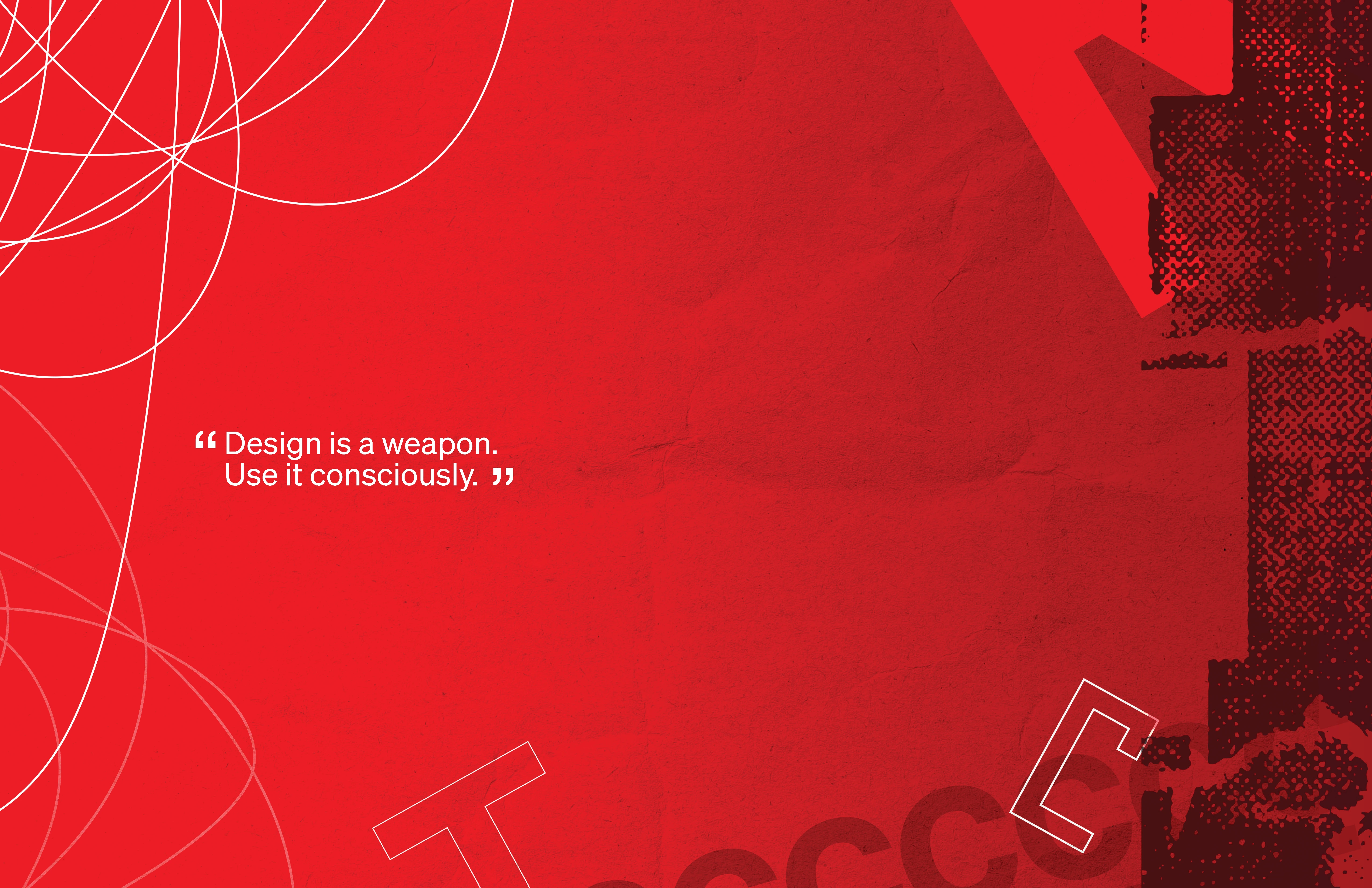
CTRLBREAK is a speculative exhibition identity for a Neville Brody retrospective. It's built around the idea that you can only break a rule if the rule was real in the first place.
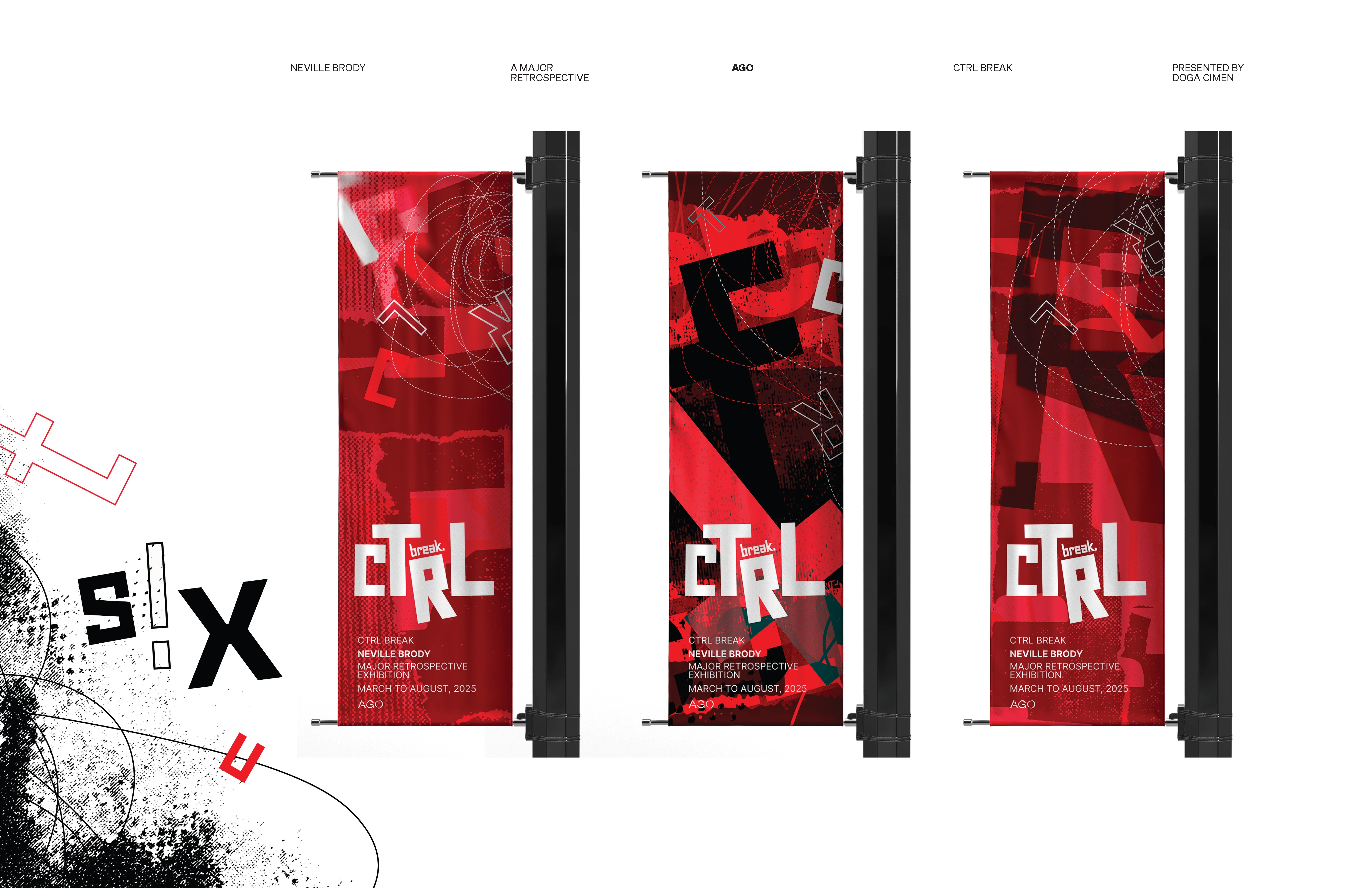
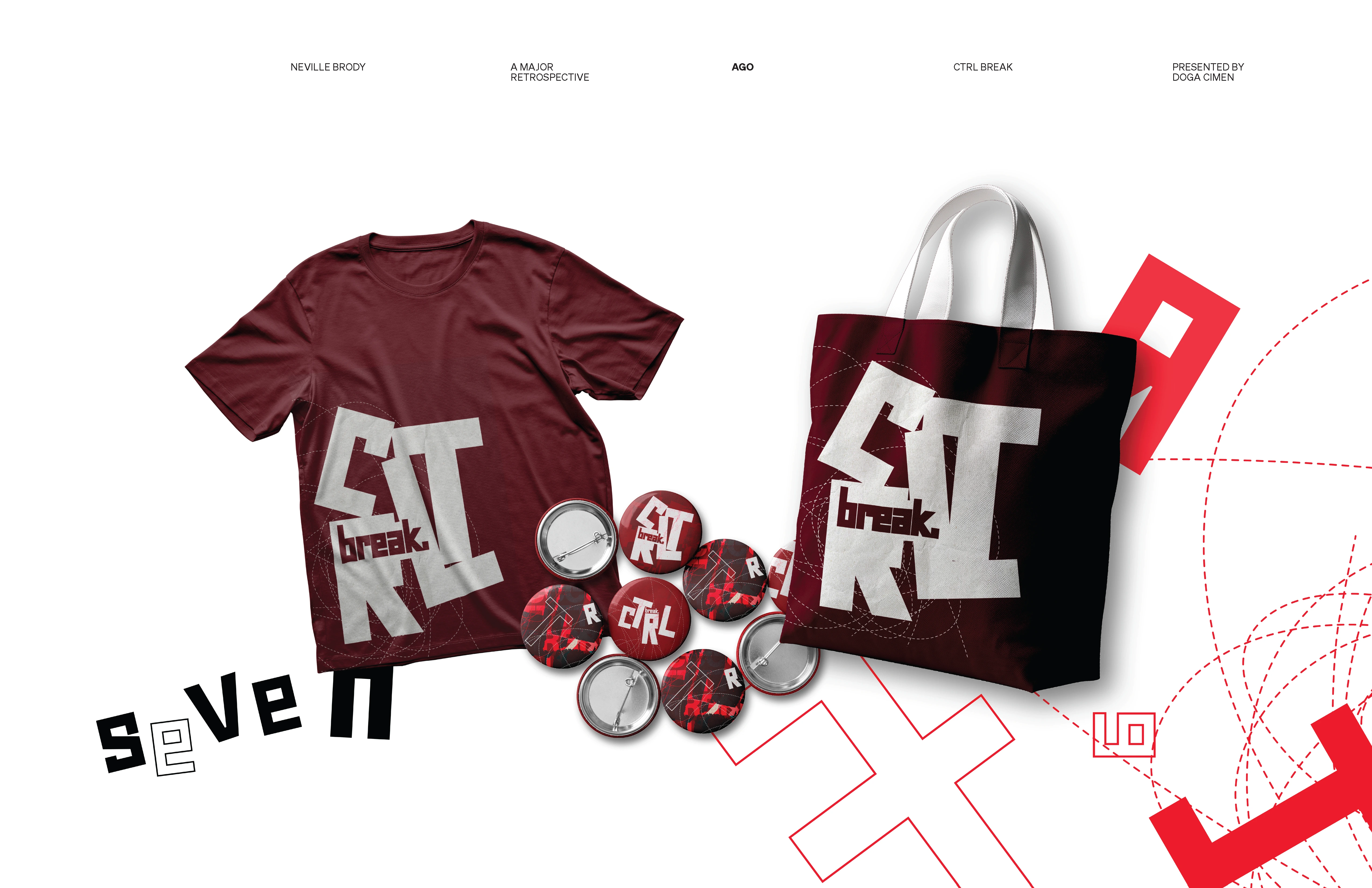
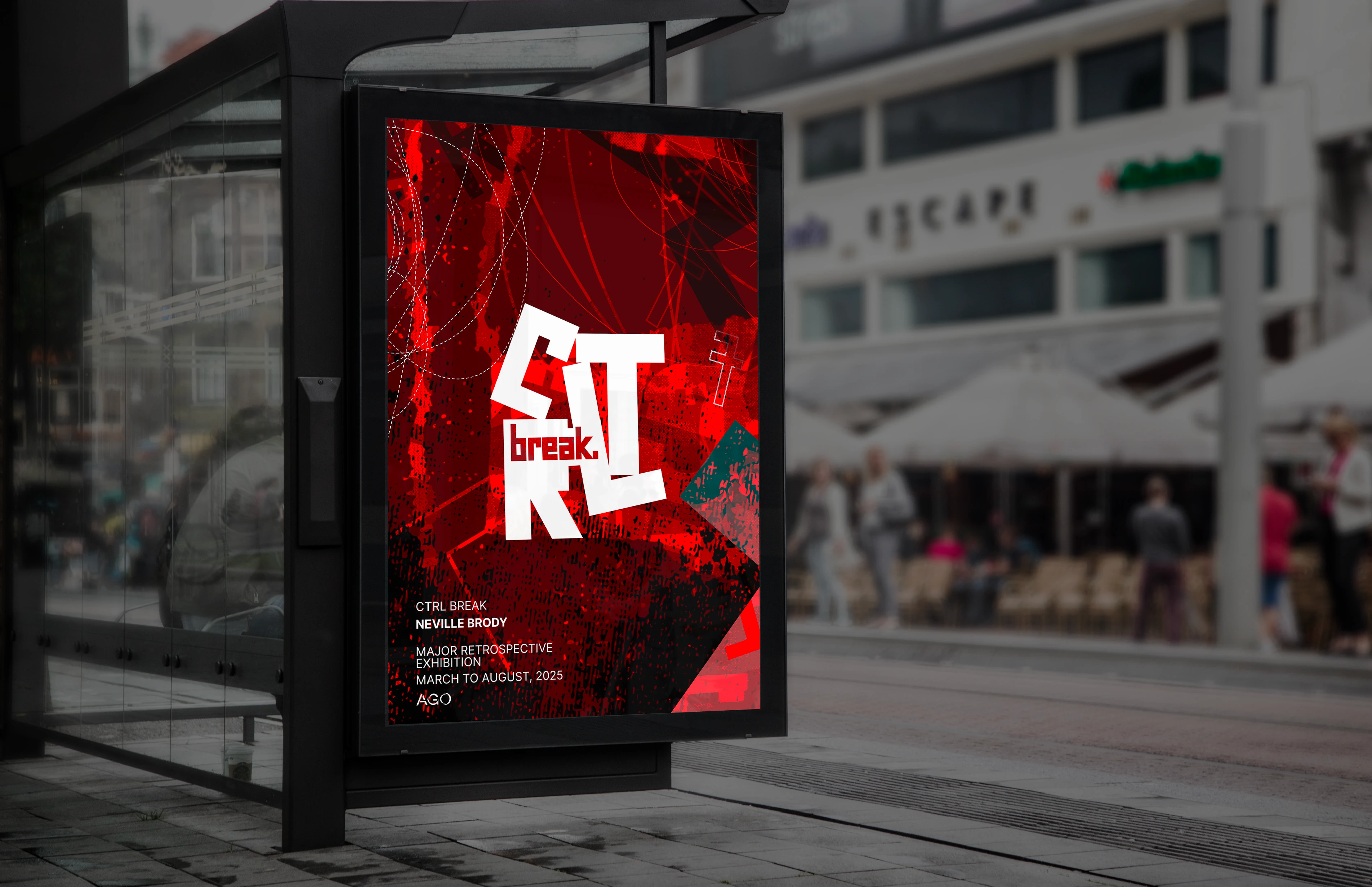
The system spans wordmark, grid logic, print mockups, and a 13-page pitchbook that acts as the identity's primary container.
Visual language.
The identity needed to feel studied, not nostalgic. It borrows Brody's logic, not a costume version of his aesthetic.
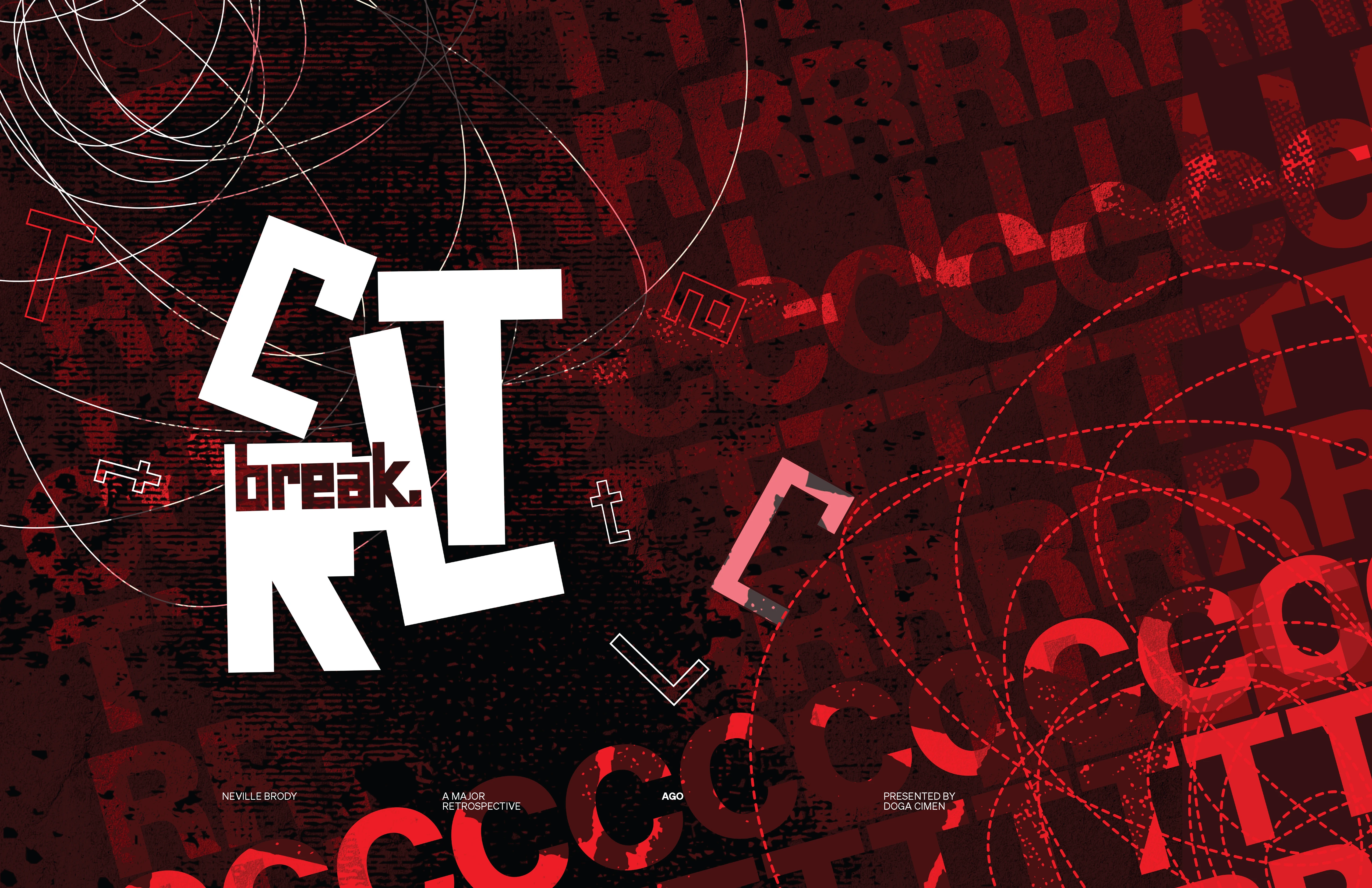
Type system
geo
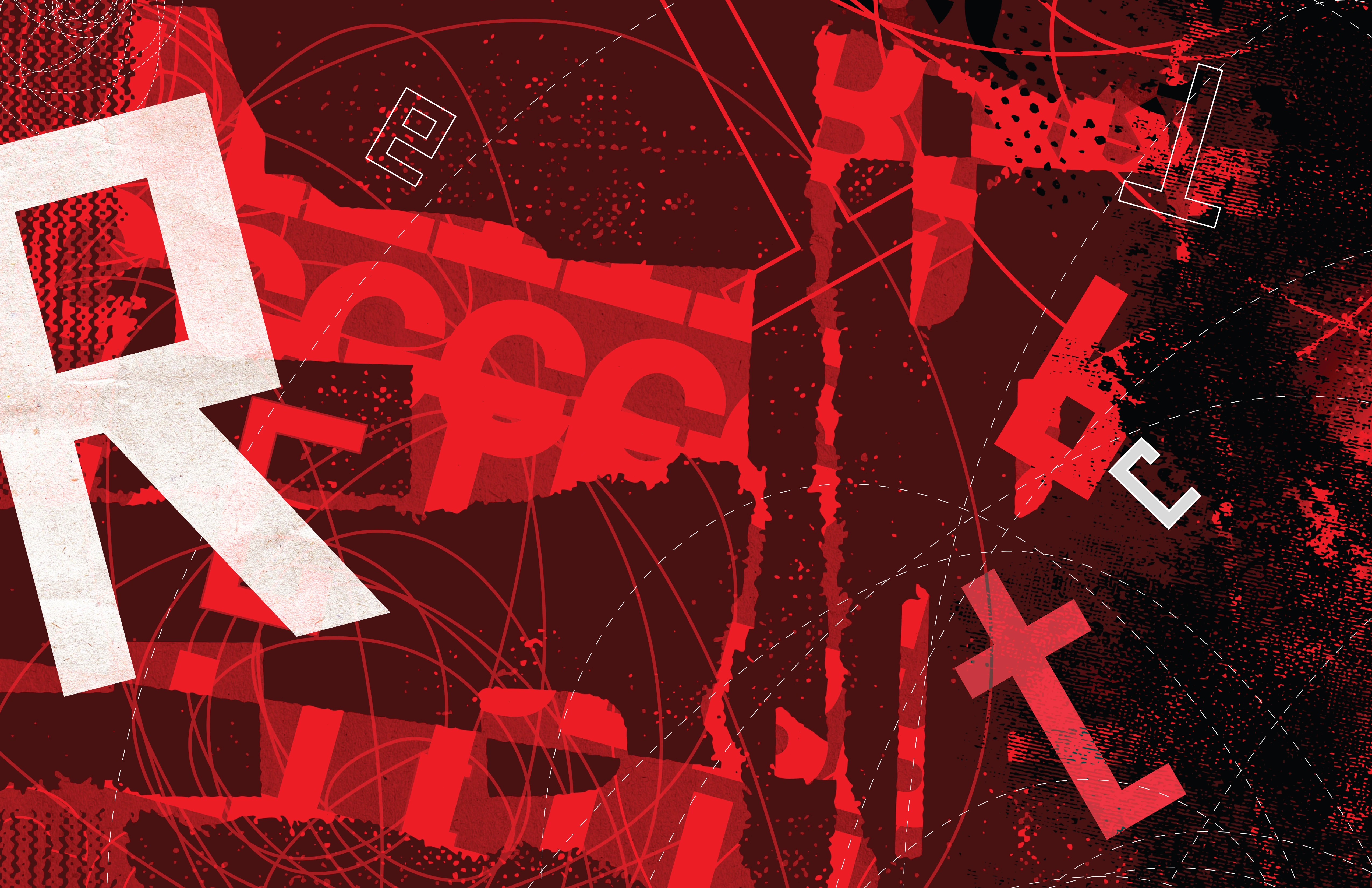
GEO is the display face. It's geometric and mechanical. It's used for the wordmark and the floating character texture across the deck.
helvetica
Helvetica on headers. It stays neutral and structured. It's the backbone for everything outside display type.
slabo
Slabo on body copy. Nice contrast to Helvetica. Brings warmth and makes long copy readable without fighting the headers.
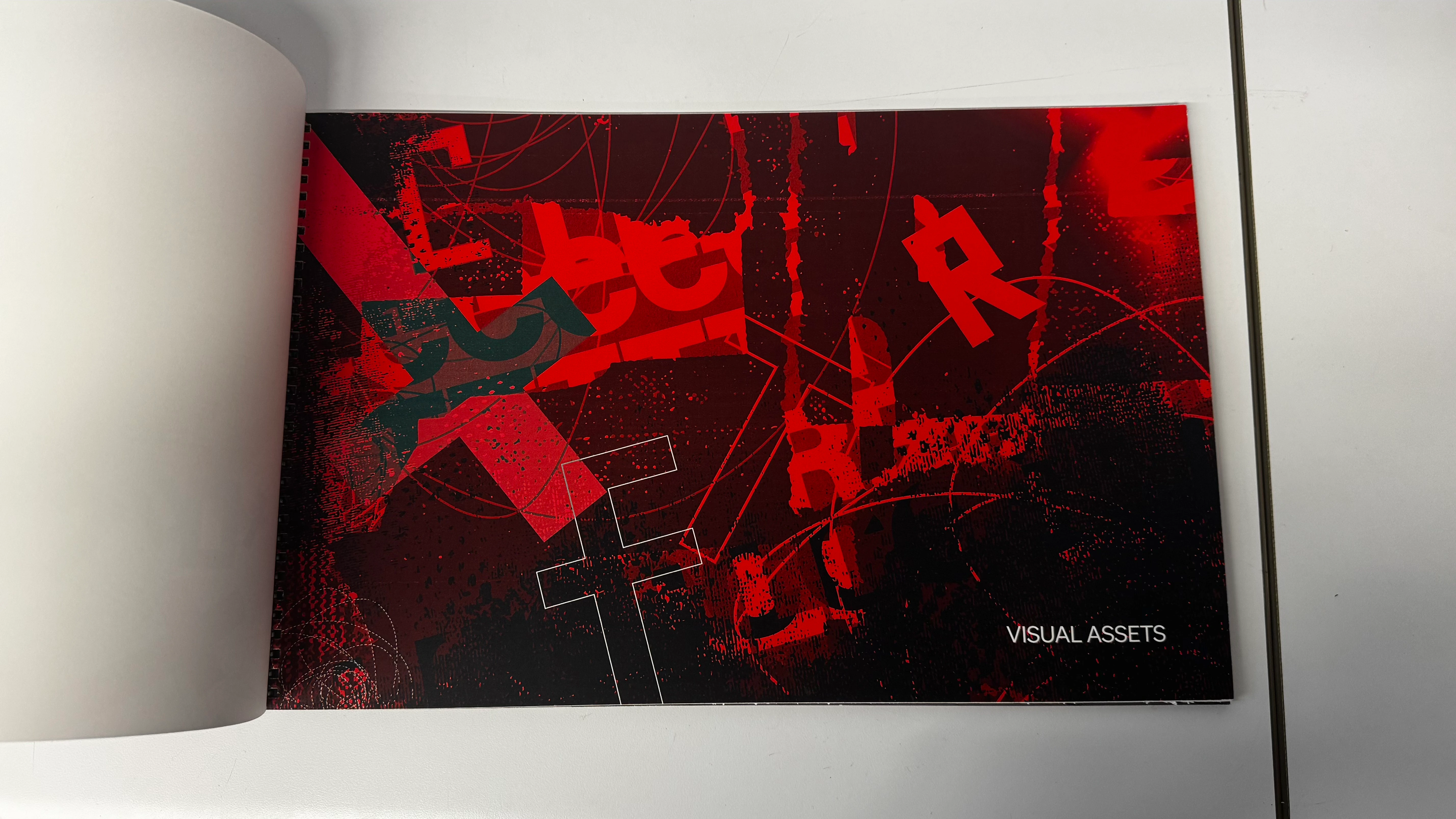
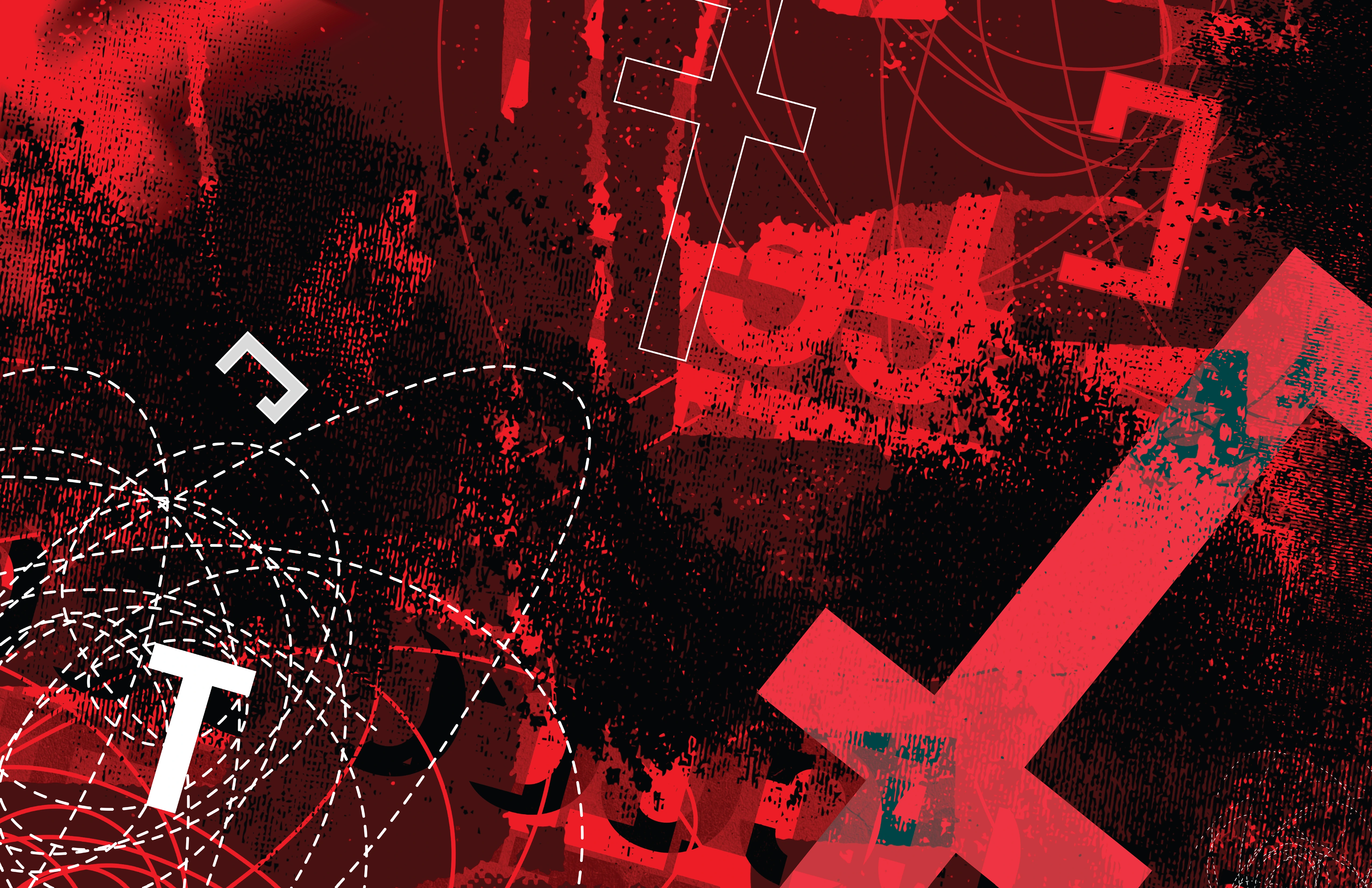
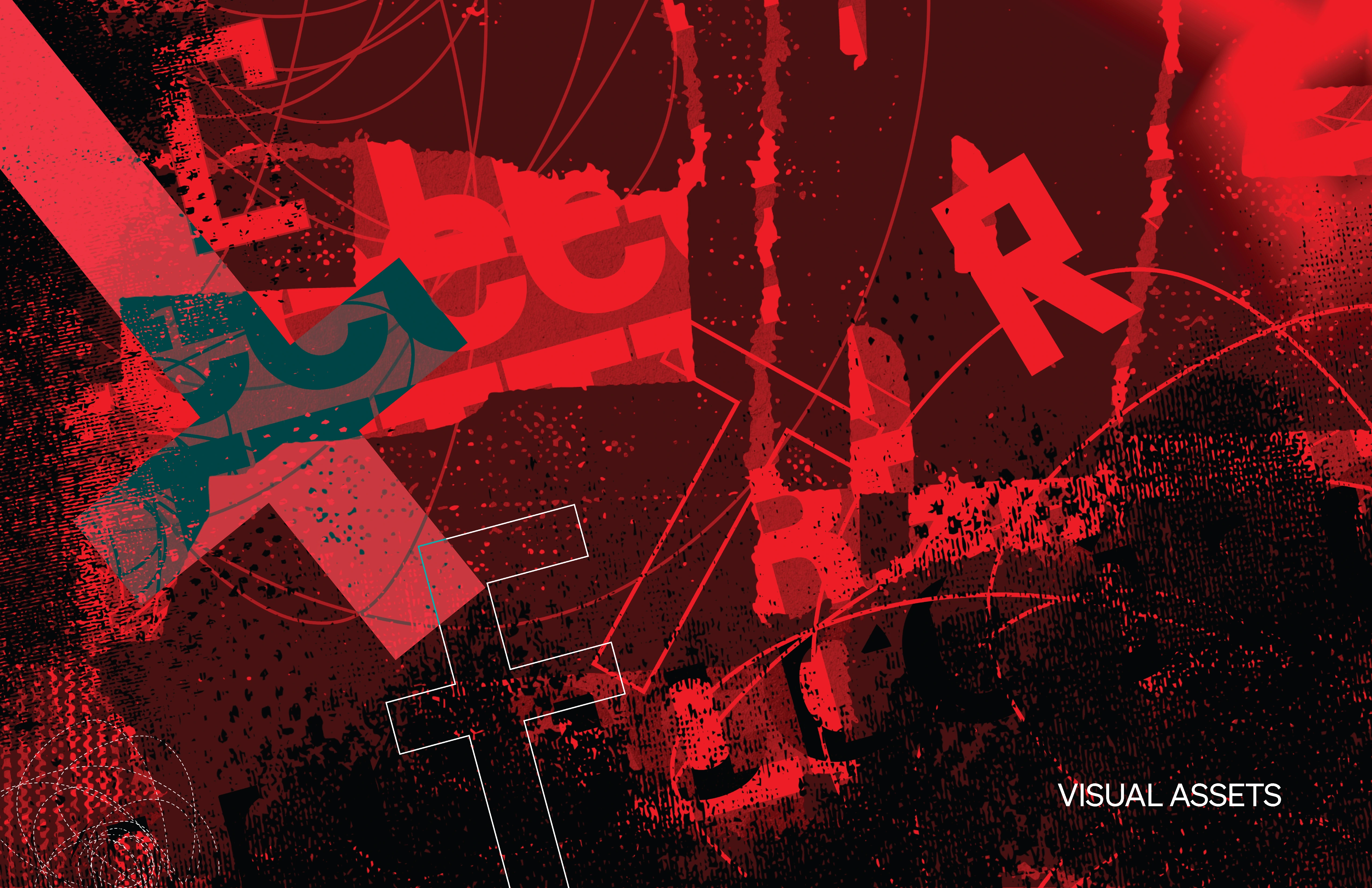
Floating geometric characters
Random GEO glyphs scattered at different sizes and rotations across the layout. No meaning, no pattern. They're just there because they looked good and added texture to otherwise heavy typographic pages.
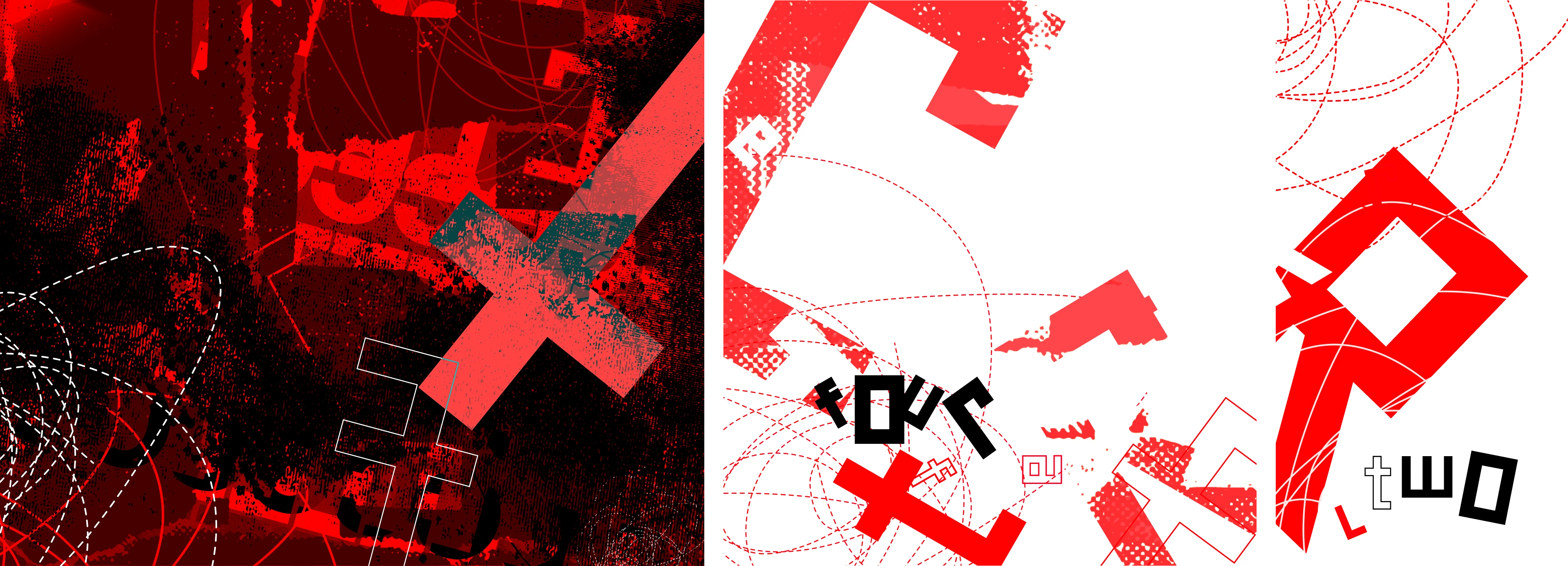
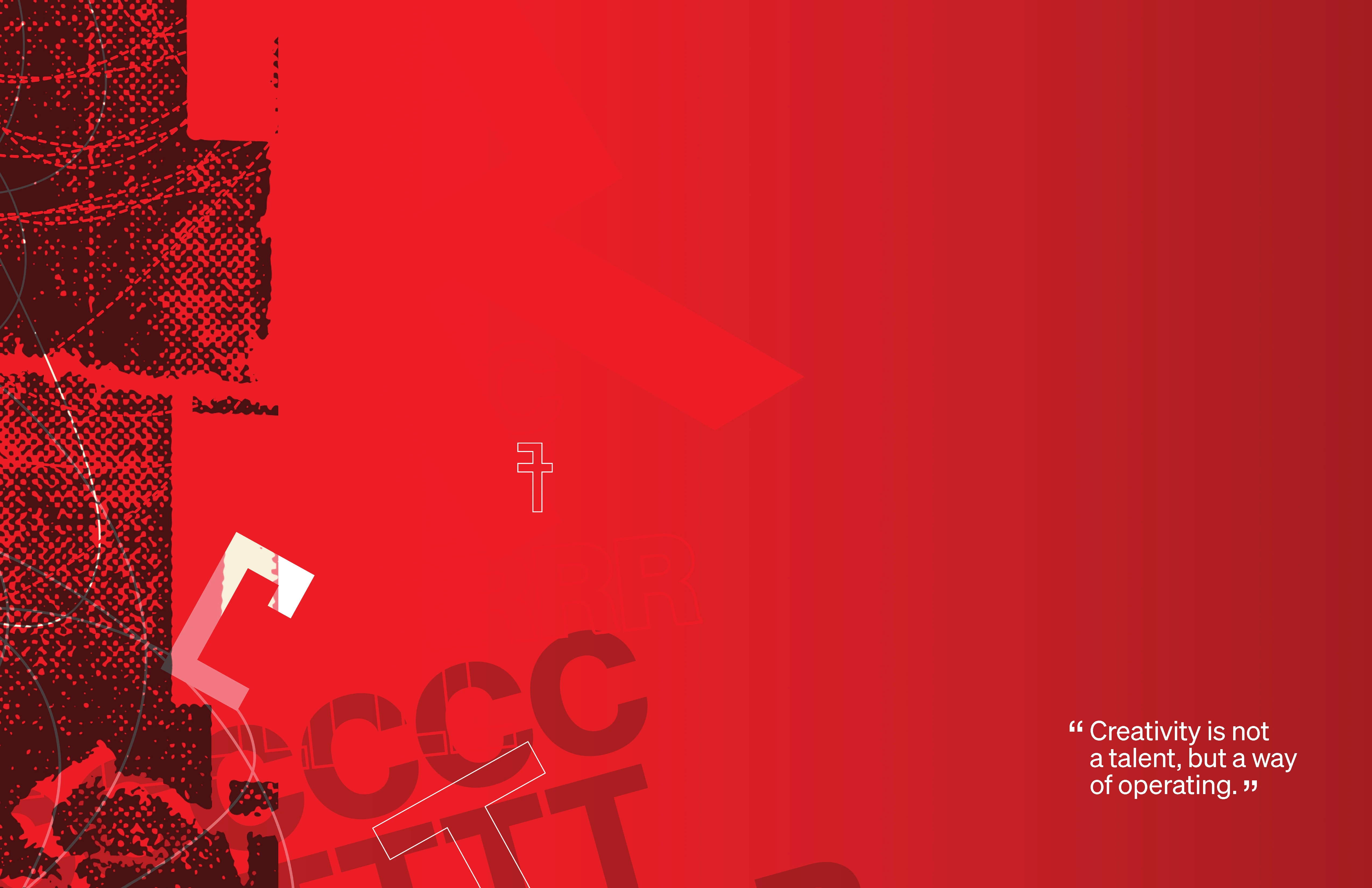
Freeform wire system
A mix of solid and dashed lines drawn with no grid logic. They cross, overlap, go wherever. The intersection dots show where lines collide. The whole thing reads like controlled chaos on paper, which was kind of the point.
Printing the physical pitchbook
Print production treated the identity as physical material, not a screen export. Letterforms were built for stencil logic, ink texture, and industrial registration — then pressure-tested across garment, surface, and wall-scale applications before the exhibition system was finalized.
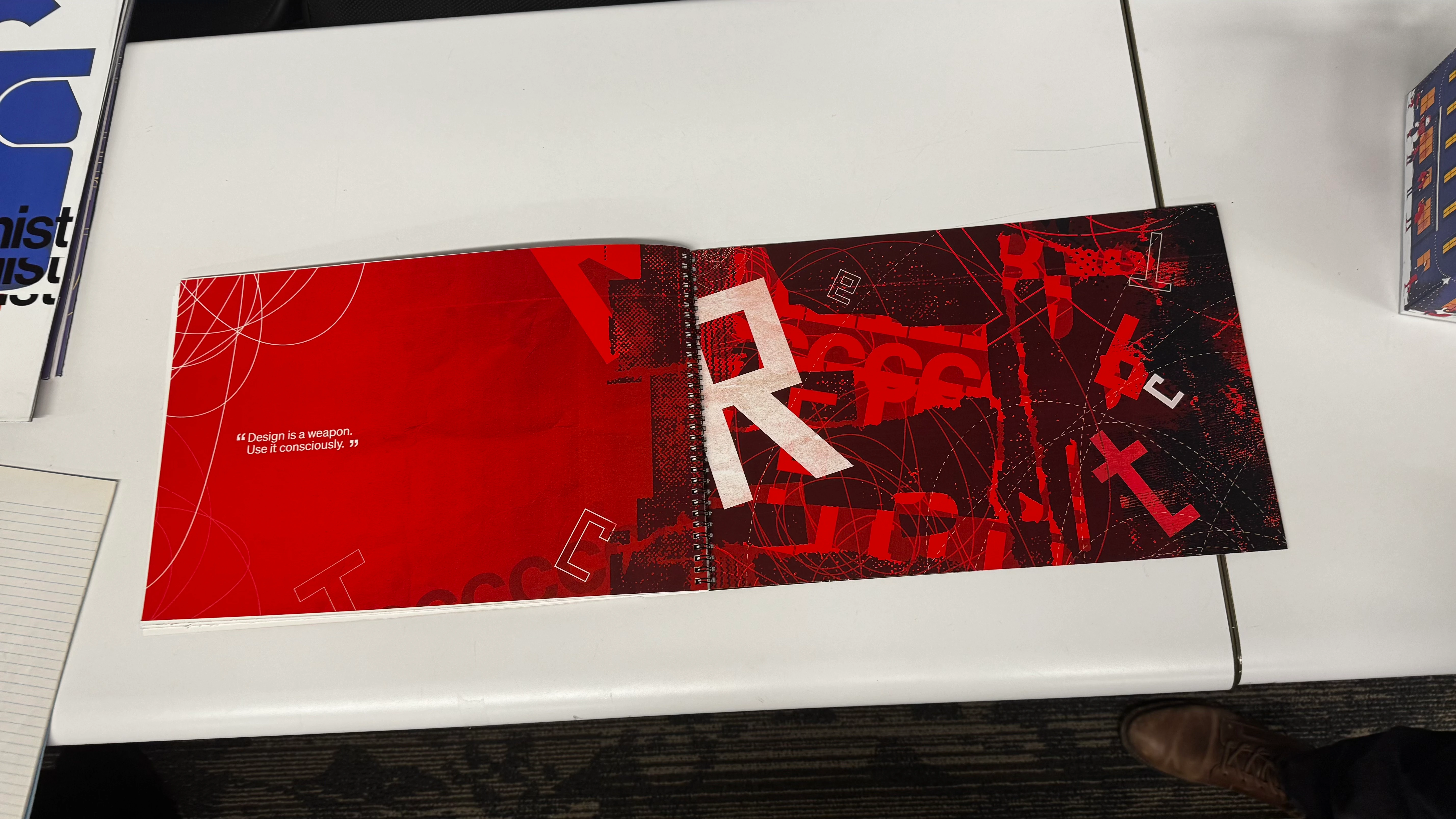
Pitchbook.
Every deliverable - posters, signage, print mockups, and brand applications - lives inside a 13-page pitchbook. The book is not a container for the system. It is the system.
Reflection
What I'd change
I'd push the visible-rule system further into motion and environmental applications. The static identity holds up, but the interruptions would land harder if the break-and-reset logic carried through signage, wayfinding, and exhibition titles — not just the core mark.
What I learned
Referencing a designer like Brody is risky because imitation is easy. The useful move was to study the decision-making logic, then translate that logic into a new system.