👋 I'm Doğa, a digital product designer based in Toronto.
I design beautiful digital SaaS products that make sense for both the people using them and the teams shipping them. Let's talk if you'd like to learn more.
I work across full-stack product design and product strategy.
Right now, I’m building an ed-tech productivity platform aimed at improving how students and self-learners plan, track, and sustain their progress, set to launch soon.
Week 6+: (MVP is currently paused since October 2025)
Intro
One day, while talking with Eric, a friend from the product world, our conversation turned to careers and life. The topic drifted to golf, since a major golf tour was happening in the U.S. at the time. From there, we started discussing the possibilities of AI and how “GPT wrappers” were helping thousands of people every day. We wondered if we could identify a problem space in the betting scene and create a product that might help people make smarter, more efficient betting decisions online.
1. Framing the Problem
Turn scattered research into a single, confident action.
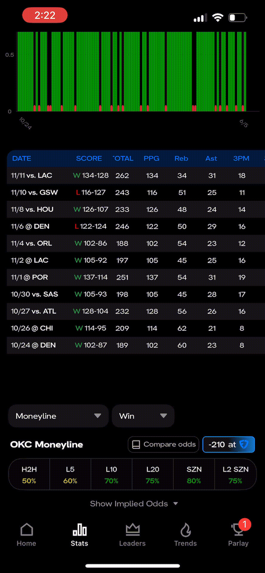
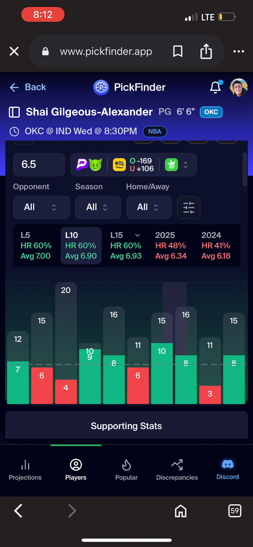
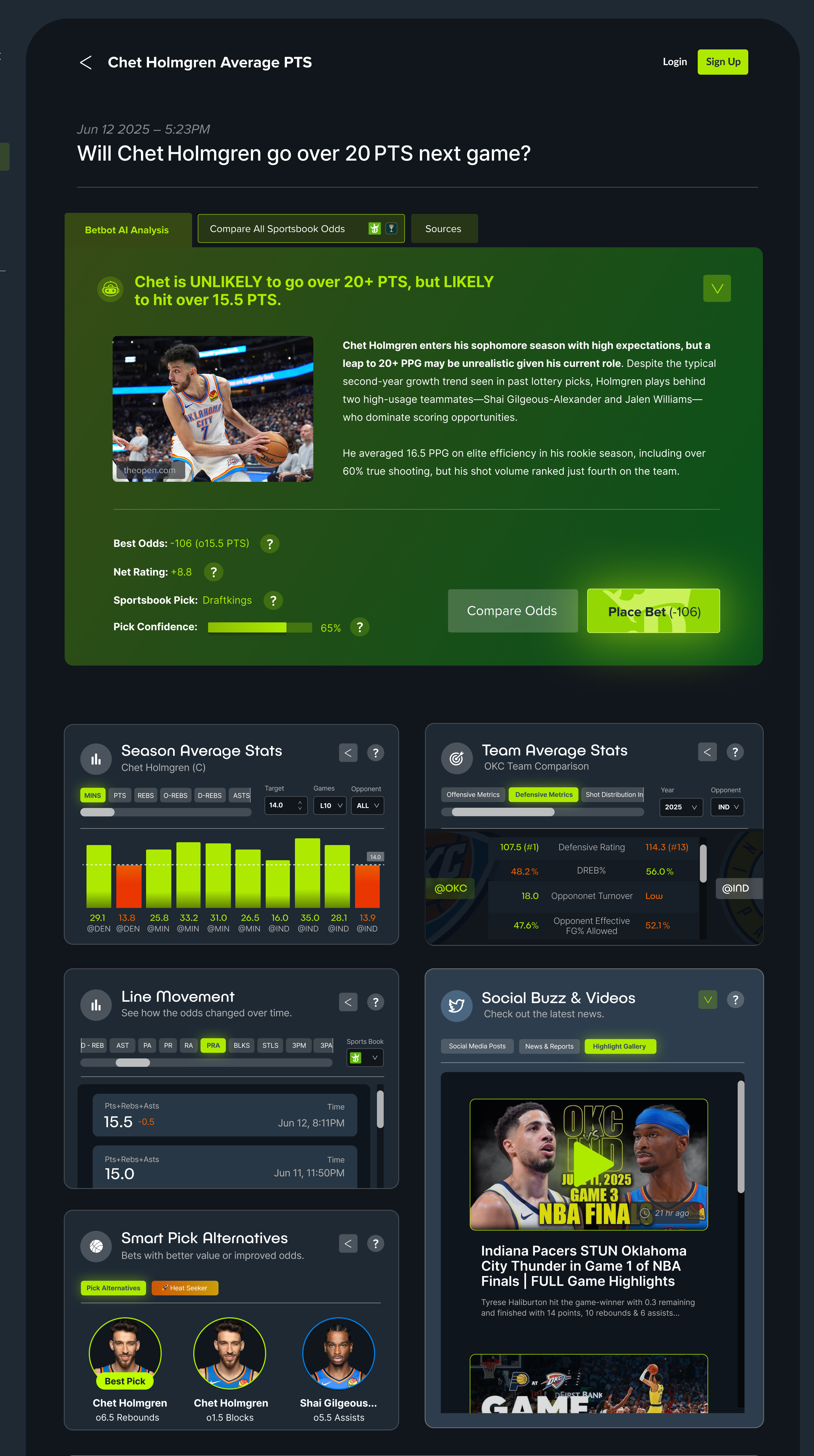
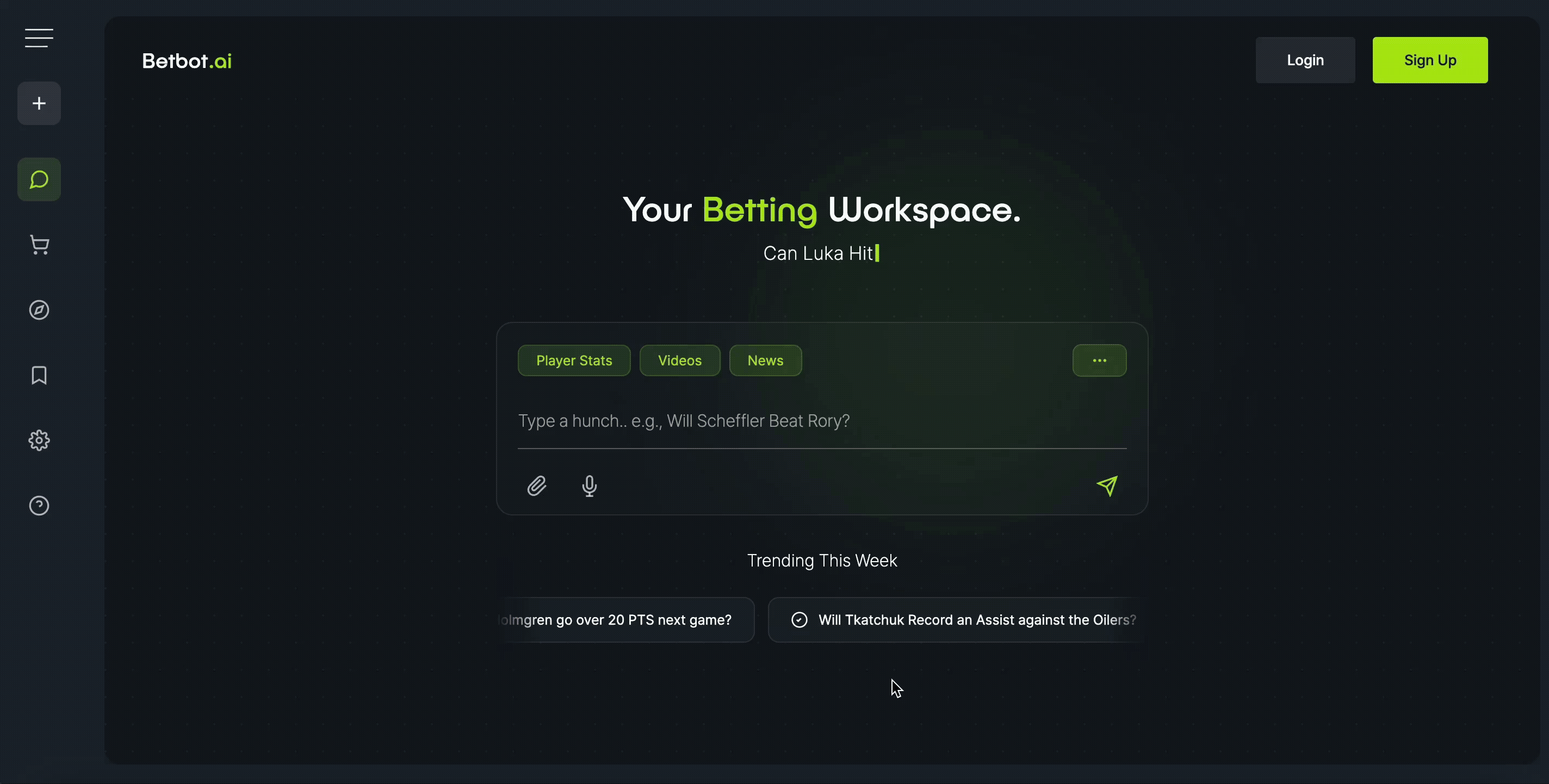
I decided to give betting a try myself to see what the experience was like. I followed the local hockey team and tried researching player data to check if their recent performance was consistent before placing a bet. I quickly realized that even basic research required opening multiple tabs, scanning endless stats, and retyping the same questions across different sites. It was really intimidating.
Most tools were packed with numbers, odds, and charts — not exactly friendly for beginners or casual bettors. When I tried using an AI chat tool like ChatGPT to ask questions about teams and odds, it still meant switching between the chat and the sportsbook to confirm the data. The information existed — it just wasn’t connected.
So I figured: if I could bridge the gap between gathering data in natural language and placing bets within that same conversation, I might have something to work with.
Different screen recordings from two separate betting analysis apps.
2. Early Research
What surprised us and what we confirmed.
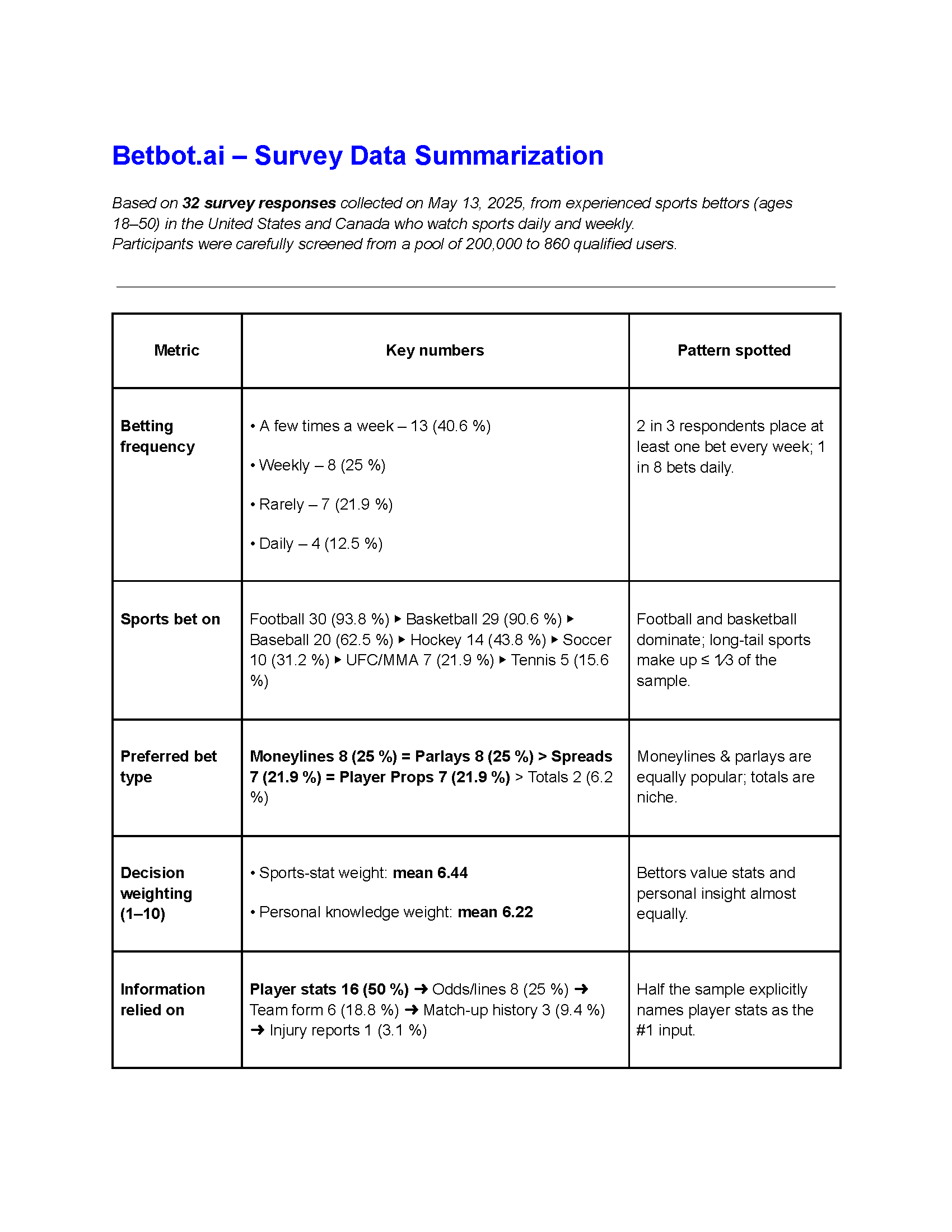
I ran a small online survey with bettors across North America. The results confirmed some assumptions and challenged others.
Experienced bettors bet often: Two-thirds placed bets weekly or more.
They value clarity: Nearly 70% said they trusted data more when the source was visible.
They struggle with overload: Most agreed that clearer presentation would make them feel less overwhelmed.
People wanted to understand why a bet looks good. They needed reasoning to back decisions — not just more “proof” or stats.
3. Design Challenge
Aligning complexity with a single decisive action.
How might we turn complex betting research into a simple, confident action?
4. Design Process
From an overwhelming dashboard to a clear, chat-first UI.
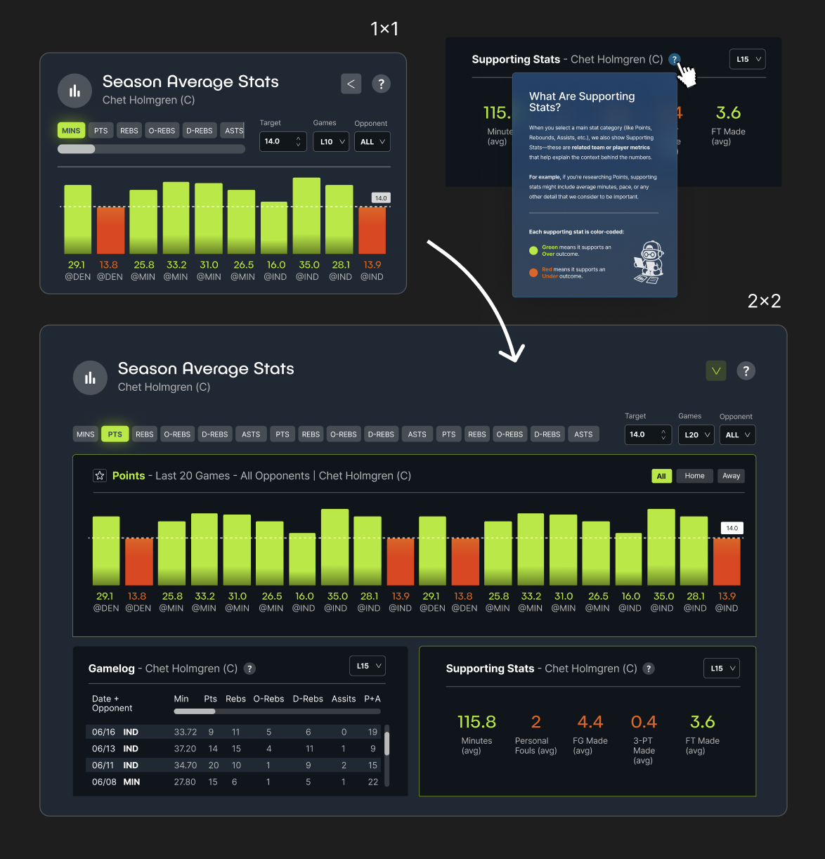
Iteration 1 — The Dashboard Problem
I started with a familiar pattern: a stats dashboard. It looked powerful but felt overwhelming. When I tested it with users — and checked in with our developer for feasibility — both found it intimidating. For our developer, the system was technically complex and hard to engineer, and users felt the data was still scattered.
Lesson: Showing more data doesn’t help people make better choices.
Iteration 2 — Switching to a Chat-First Interface
I quickly redesigned the whole experience as a natural‑language chat. Users could ask questions and receive clear summaries, followed by optional data cards for deeper insights. We also added a quick customization step: before asking a question, users could choose the types of data they wanted to see; if they skipped it, the AI replied with plain text only.
Lesson: More data doesn’t automatically earn trust, but clarity does.
5. Key UX/UI Components
Components designed for clarity and action.
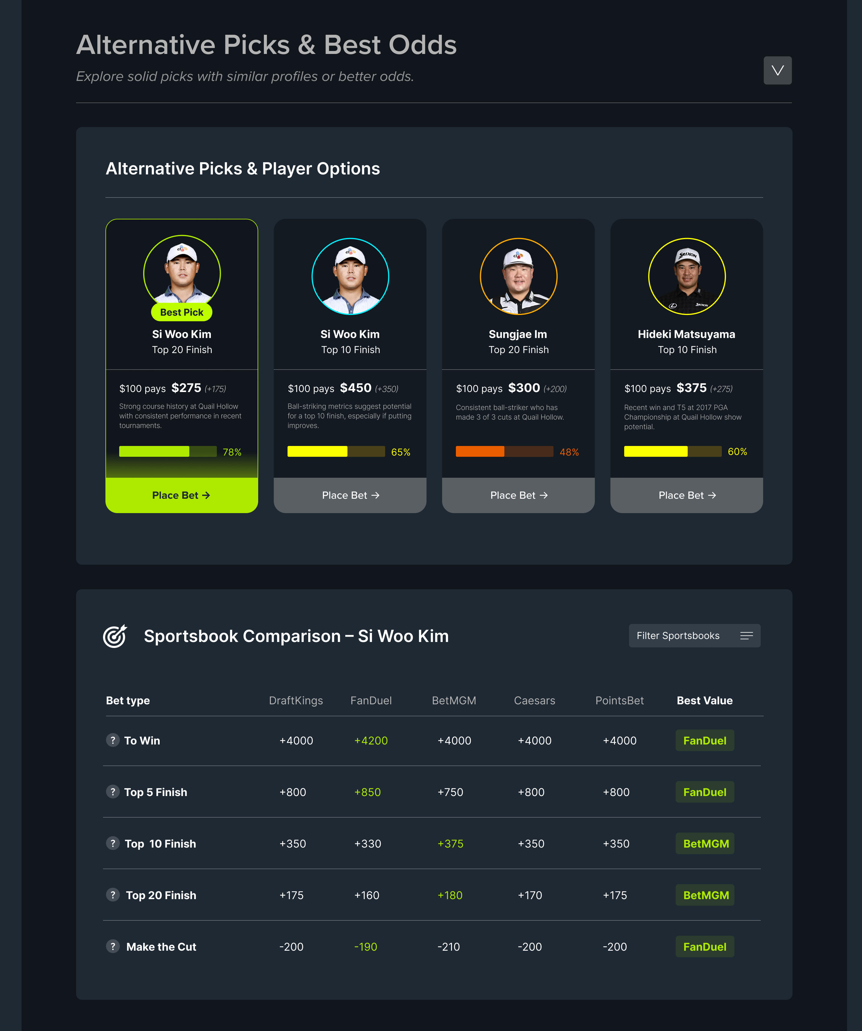
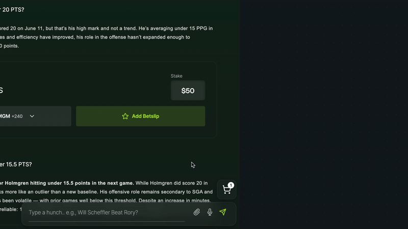
Comparison Options: Visual components where you can compare multiple players, teams, or stats at once, without starting a new chat.
Odd Comparison Tables: Visual summaries with odds, trends, and comparisons for quick scanning.
Betslip Management Tool: Manage all your bet options you explored in one place before placing them, while interacting with the chat, in real-time.
6. Building the Prototype
A working flow using AI-assisted tools.
When our developer left mid-project, I used AI-assisted tools to continue. Replit’s AI agents helped wire up a basic chat flow connecting prompts, messages, and odds data. It wasn’t pretty, but it worked.
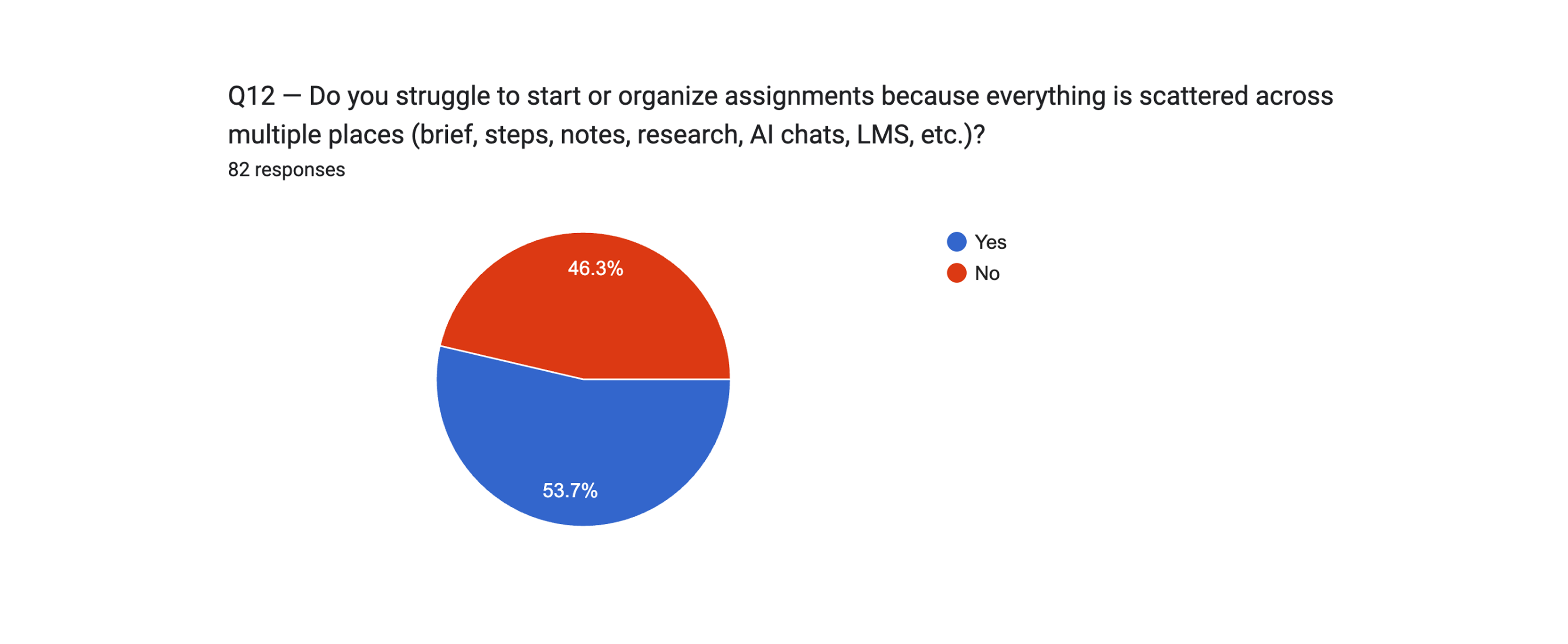
This survey included 81 university and college students who had all submitted at least one assignment in the last three weeks. The goal was to understand where they struggle most: starting, organizing, or managing assignments across different tools and AI.
1. Core Insight
53% — roughly 1 in 2 students — struggle to start or organize assignments because their brief, notes, resources, and AI outputs are scattered across too many places.
→ This is the primary problem BriefTutor is designed to solve.
2. Why Students Struggle
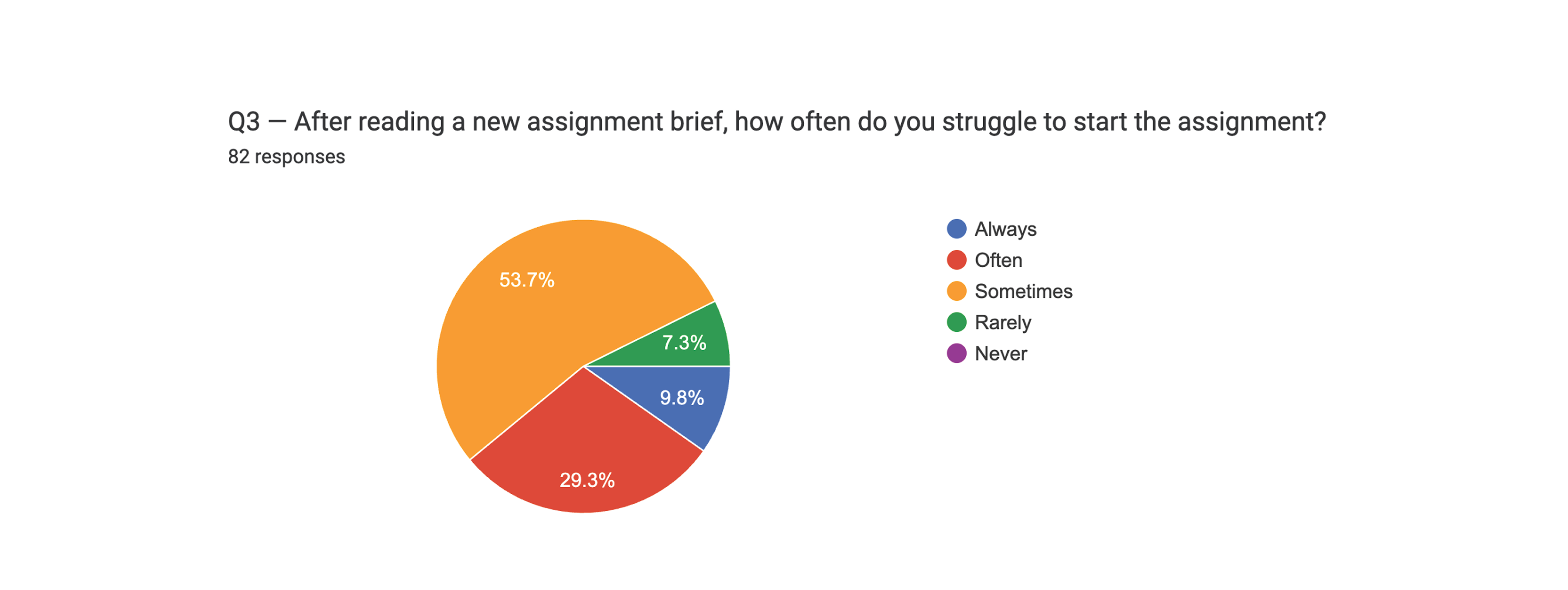
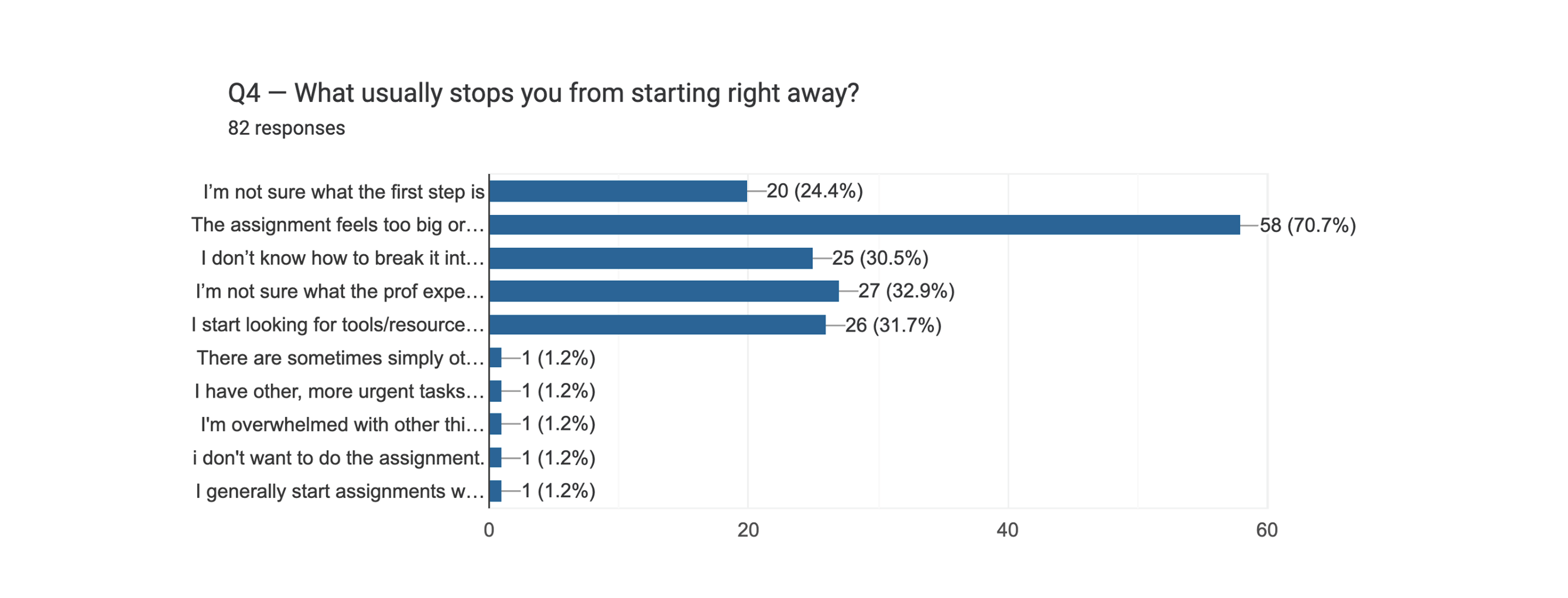
A. Starting is difficult
38% often or always struggle to start even after reading the brief
72% say assignments feel "too big or overwhelming"
→ Students don't fail to start because they lack motivation — they fail because the assignment feels large, unclear, and unstructured.
B. Students lose the sequence and constantly lose context
72% feel unclear about the sequence of steps
67% frequently re-read the brief because they forget details
This is pure cognitive overload: students aren't missing information—they're missing structure.
C. Tool fragmentation is the default, not the exception
53% use 3+ tools for a single assignment
57% say multi-tool workflows actively harm organization
Students' workflows are fragmented by default — Word/Docs + LMS + AI + Notes + YouTube.
D. AI introduces new organizational chaos
23% find it hard/very hard to track AI outputs
53% have lost an important AI answer
3. Interpretation
Across all findings, a clear pattern emerges:
Students don't struggle with understanding assignments, they struggle to organize them inside a messy, multi-tool workflow where no single workspace shows the entire path.
→ Assignments feel like a giant blob.
→ Students lose context.
→ AI makes the workflow noisier.
→ And everything lives in separate tabs.
This is the exact gap BriefTutor fills: a single, visual, structured path with built-in step-by-step AI guidance.
4. The Problem Statement
53% of students struggle to start or organize assignments because their brief, notes, resources, and AI outputs are scattered across too many tools — creating overwhelm, delays, and constant context-switching.
→ Next Steps
The next phase of research will focus on product preferences and testing whether ChatGPT's branching chat model meets students' organizational needs, or if they require a more guided, task-based system.
The story behind the idea
A classmate of mine one day was struggling keeping up with our weekly design critiques in one of our typography classes.
One day we were sitting together and he asked me about the brief for the following week. He said he read the brief but got lost in them; the long walls of texts and wording intimidated him, so he kept postponing the work until it was too late to execute properly.
I used to have the same problem—long briefs intimidated me too. What helped was sketching them out first, turning the text into a simple map on paper before starting. I took the same approach with him: we walked through the brief together while I made a few quick sketches & notes in my notebook. Seeing it laid out visually seemed to unlock it for him. He snapped a few photos of them that day and headed out for the week. At the next critique, he finally had work to show.
That moment pushed me to build brieftutor, a tool for visual-learners who struggle with text-heavy instructions. Especially under time pressure.
This action will open up a PDF file. Would you like to continue?